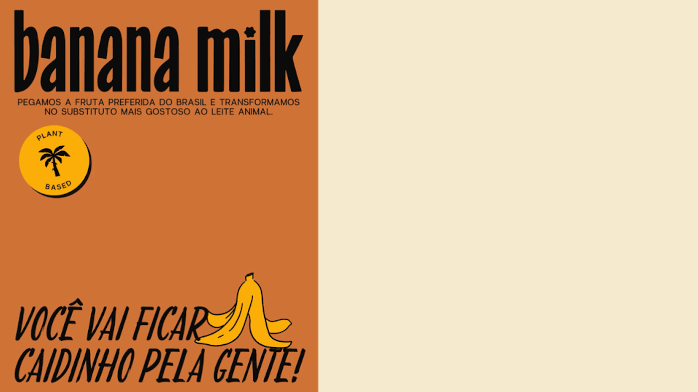

One of the main objectives for this project was to capture the richness of Brazilian culture in a way that felt fresh and free from clichés. The visual identity aimed to reference the Brazilian aesthetic while maintaining a contemporary and distinctive appeal.
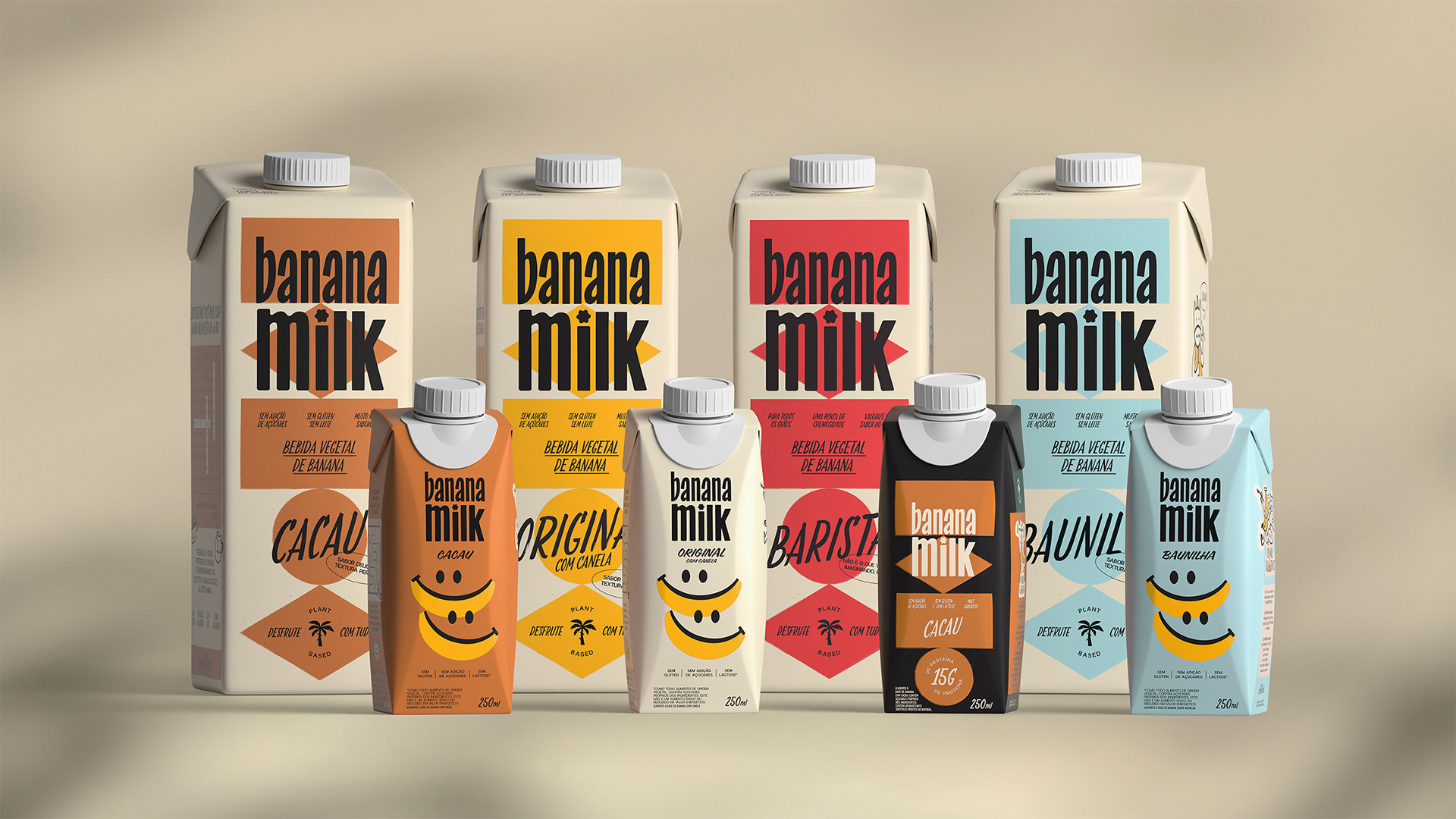
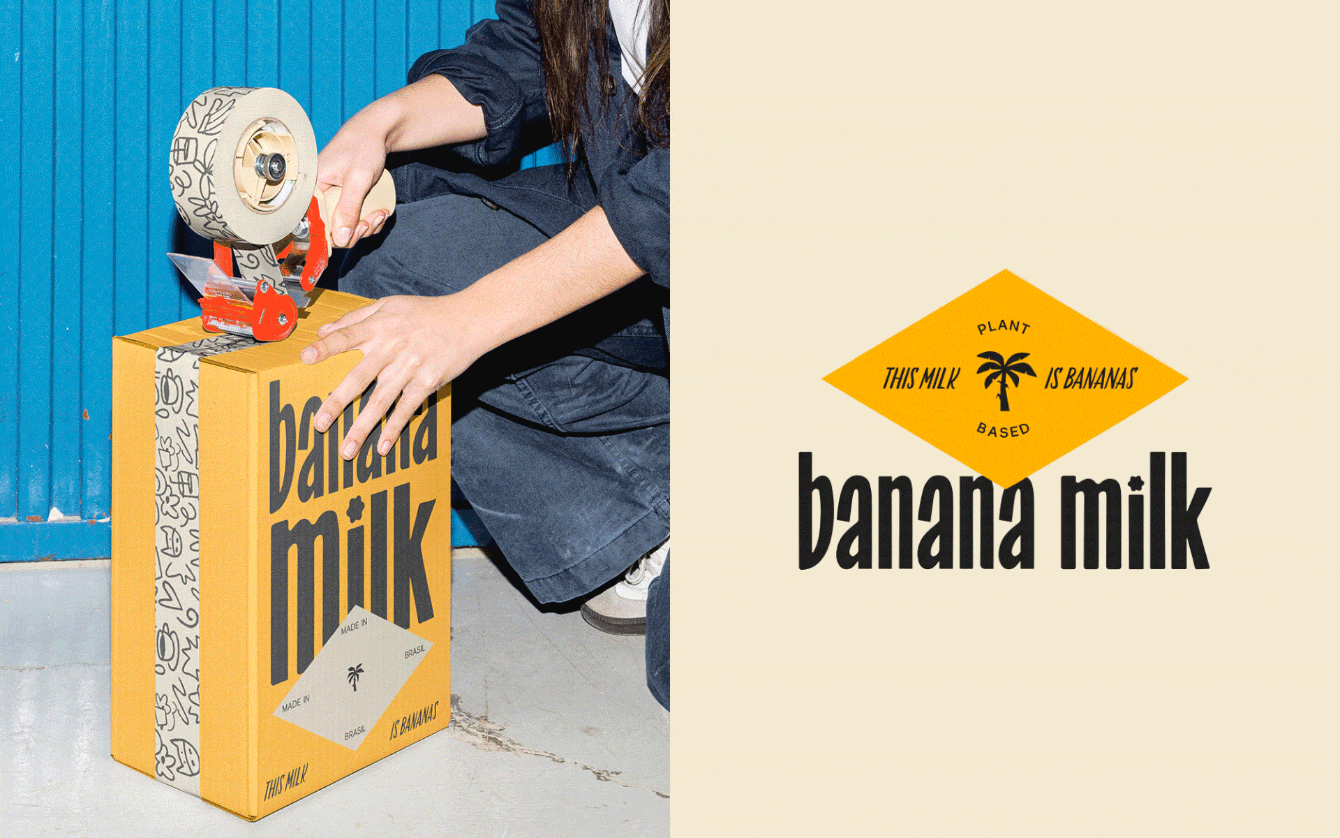
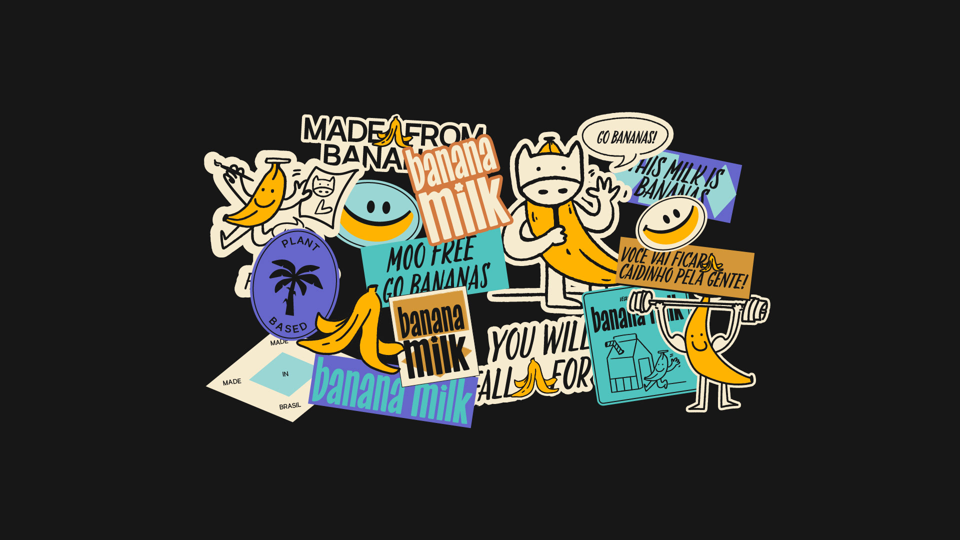
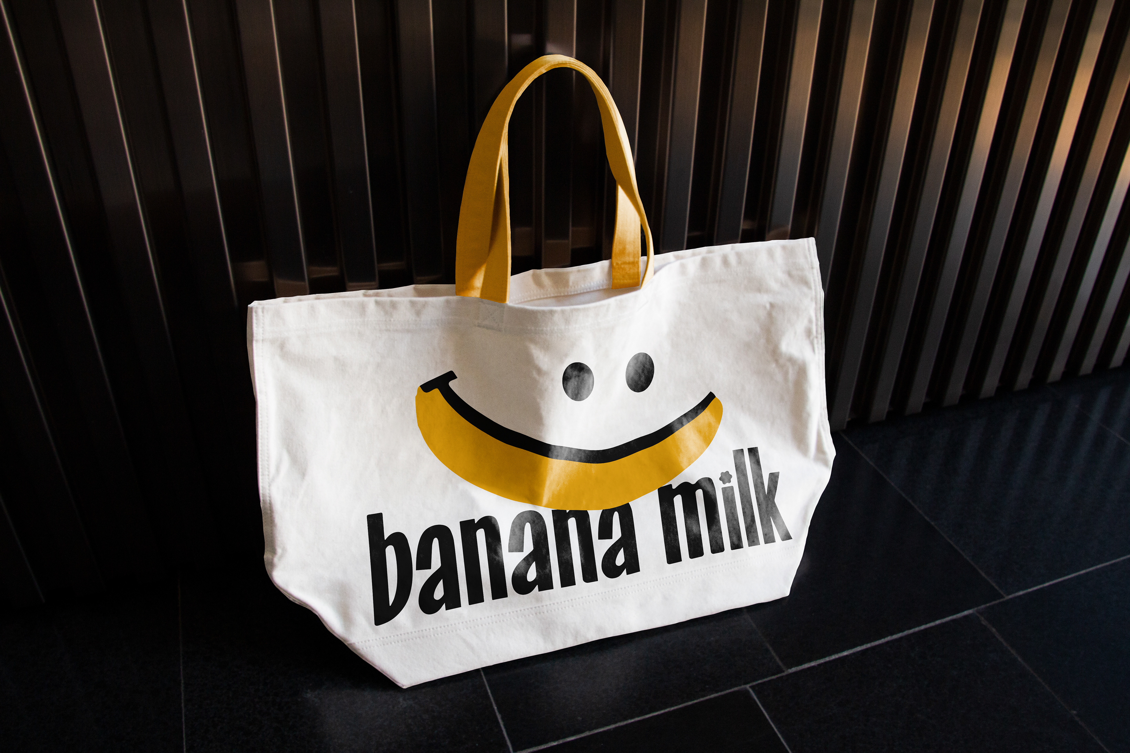
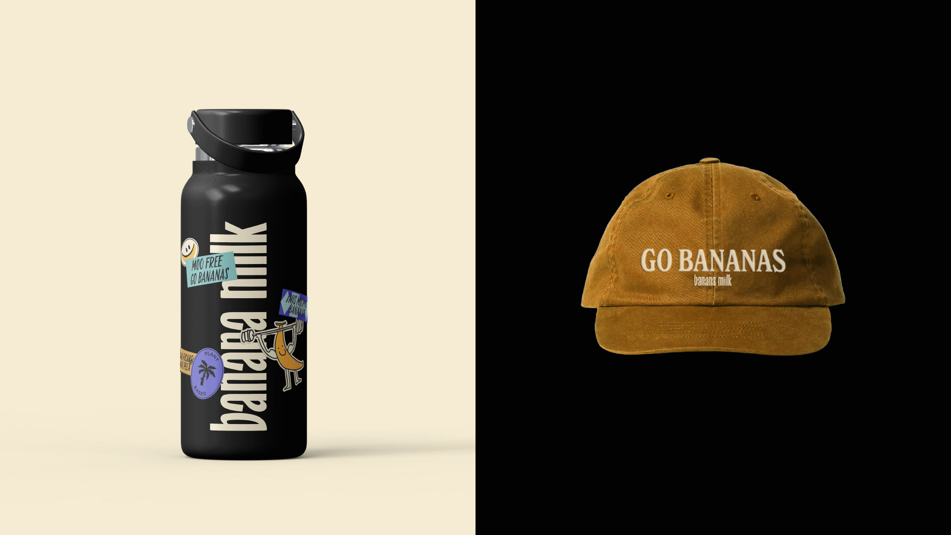
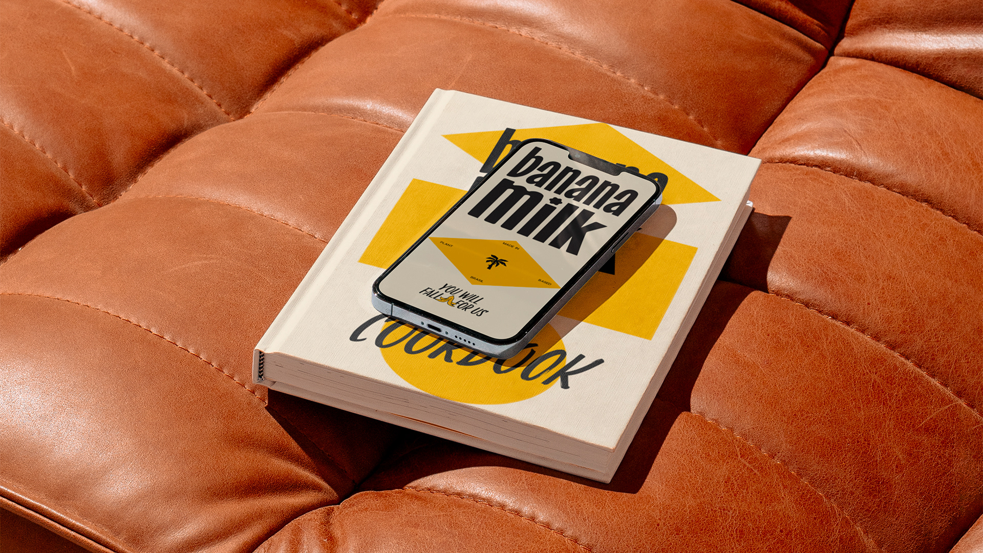
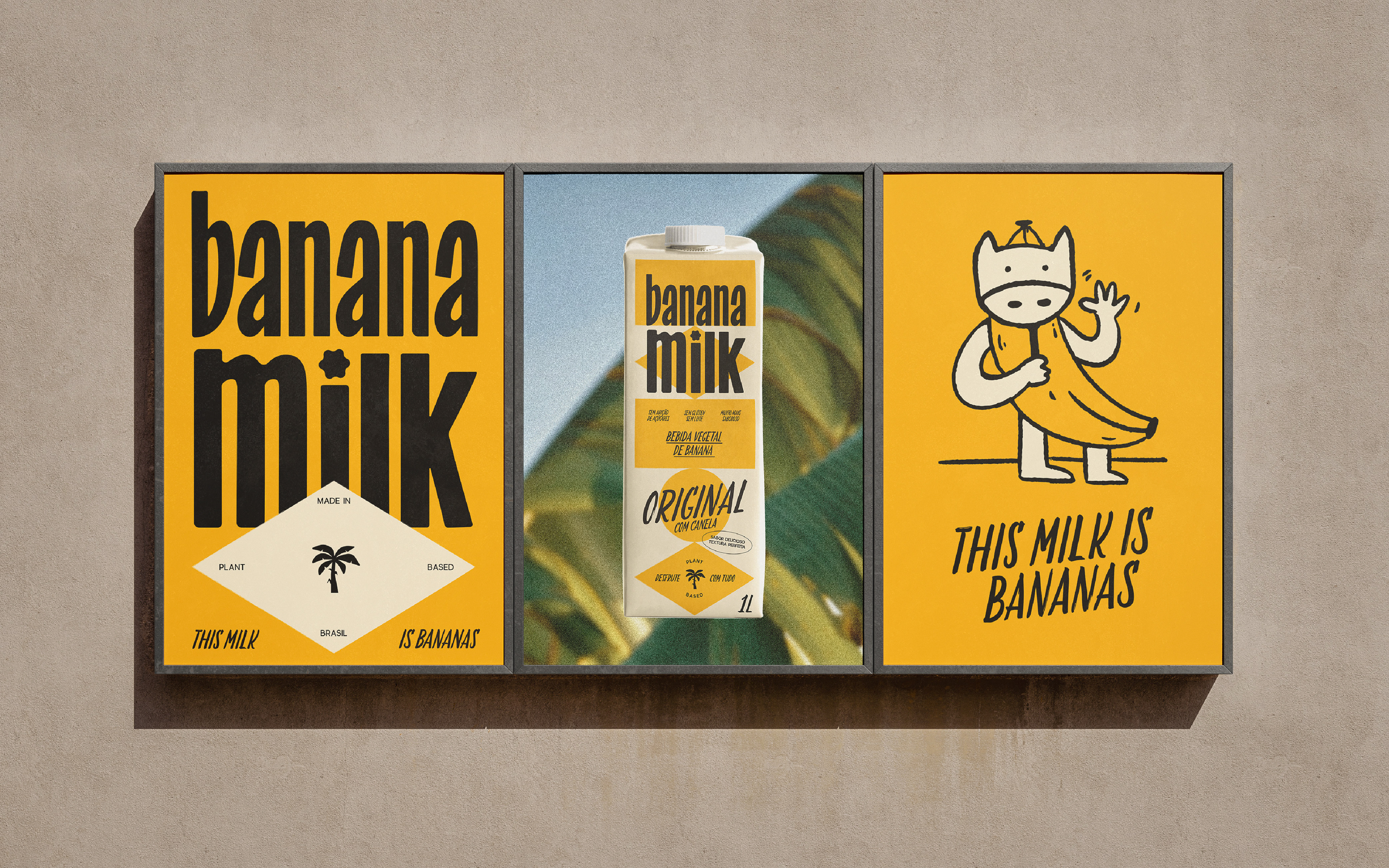
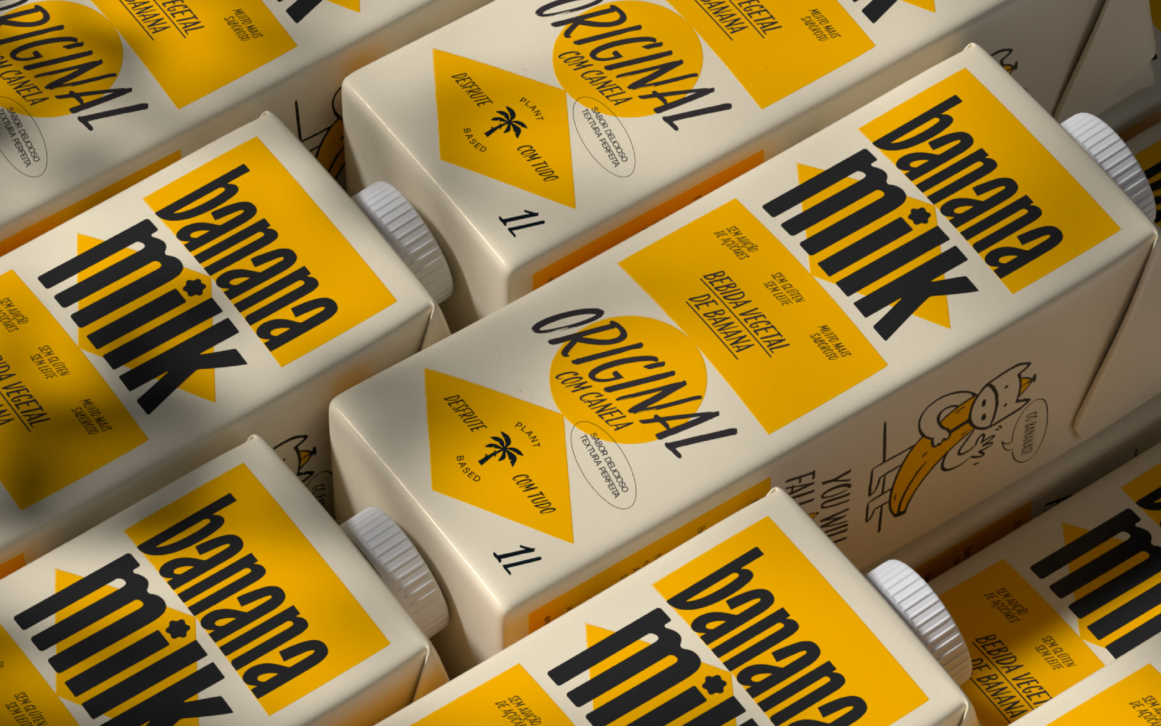
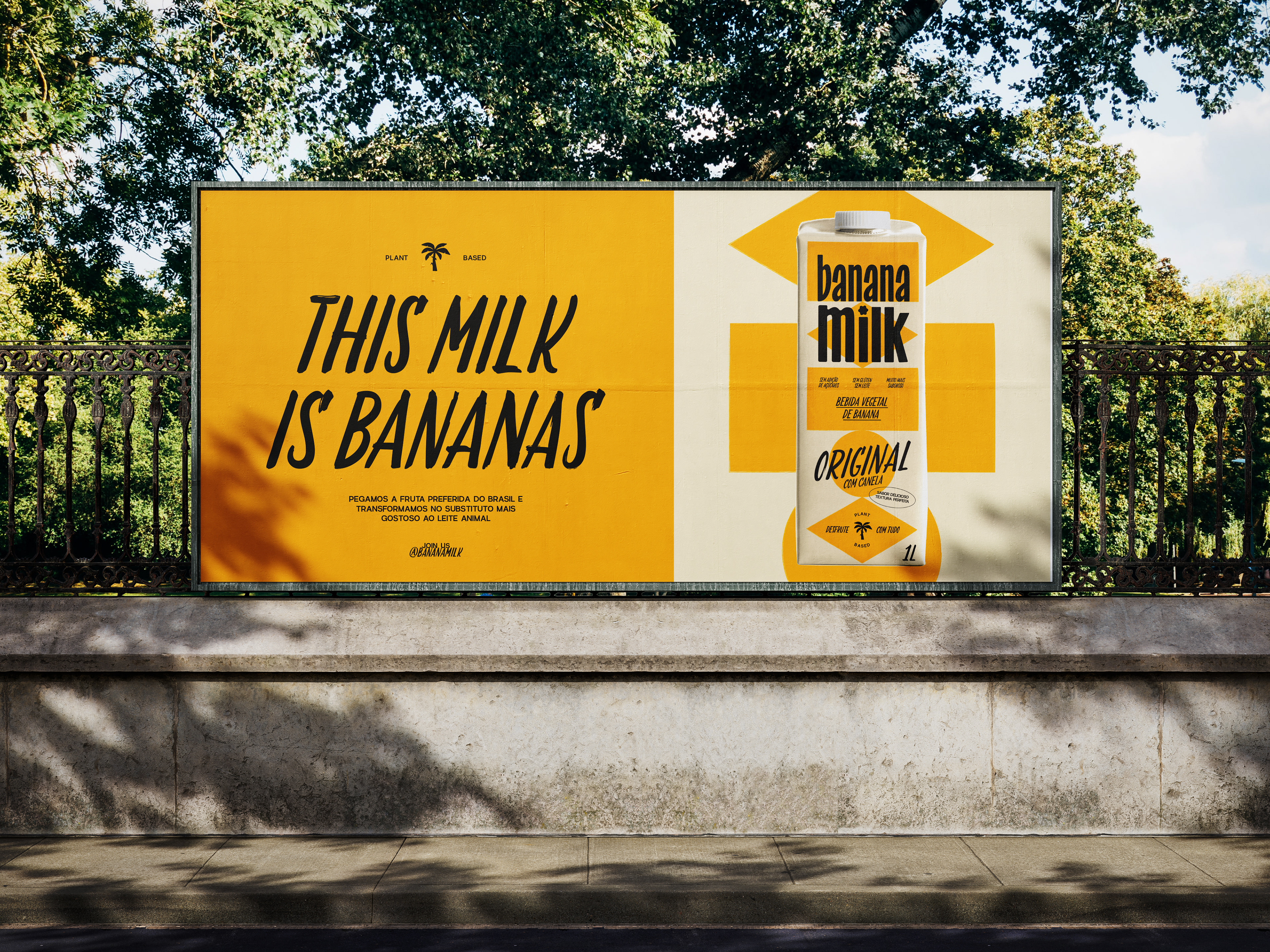
The logotype was designed with a handmade feel, drawing inspiration from Brazilian vernacular typography often seen in fruit market posters. This choice adds a sense of warmth and familiarity, reinforcing the brand’s practical, optimistic and welcoming personality
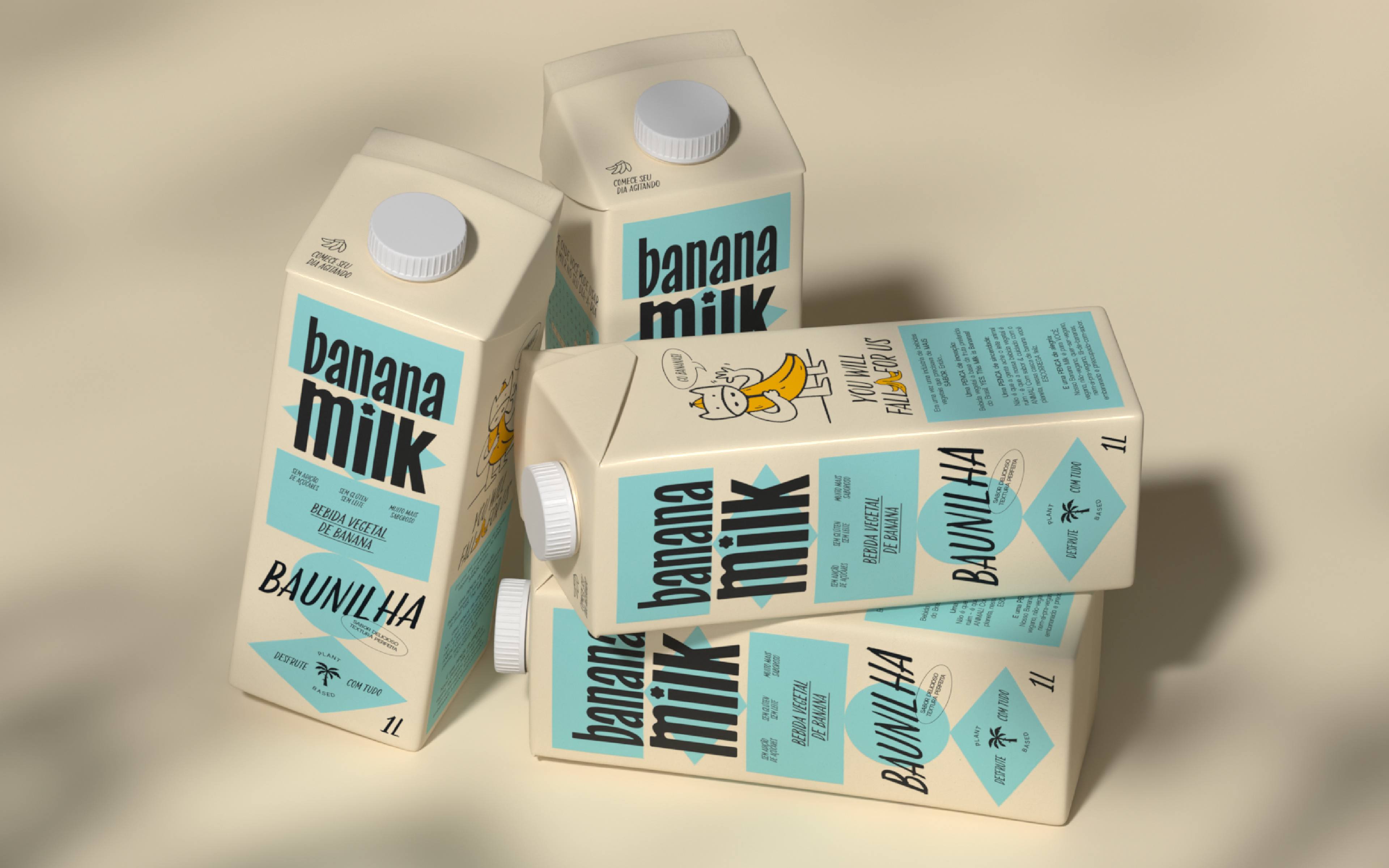
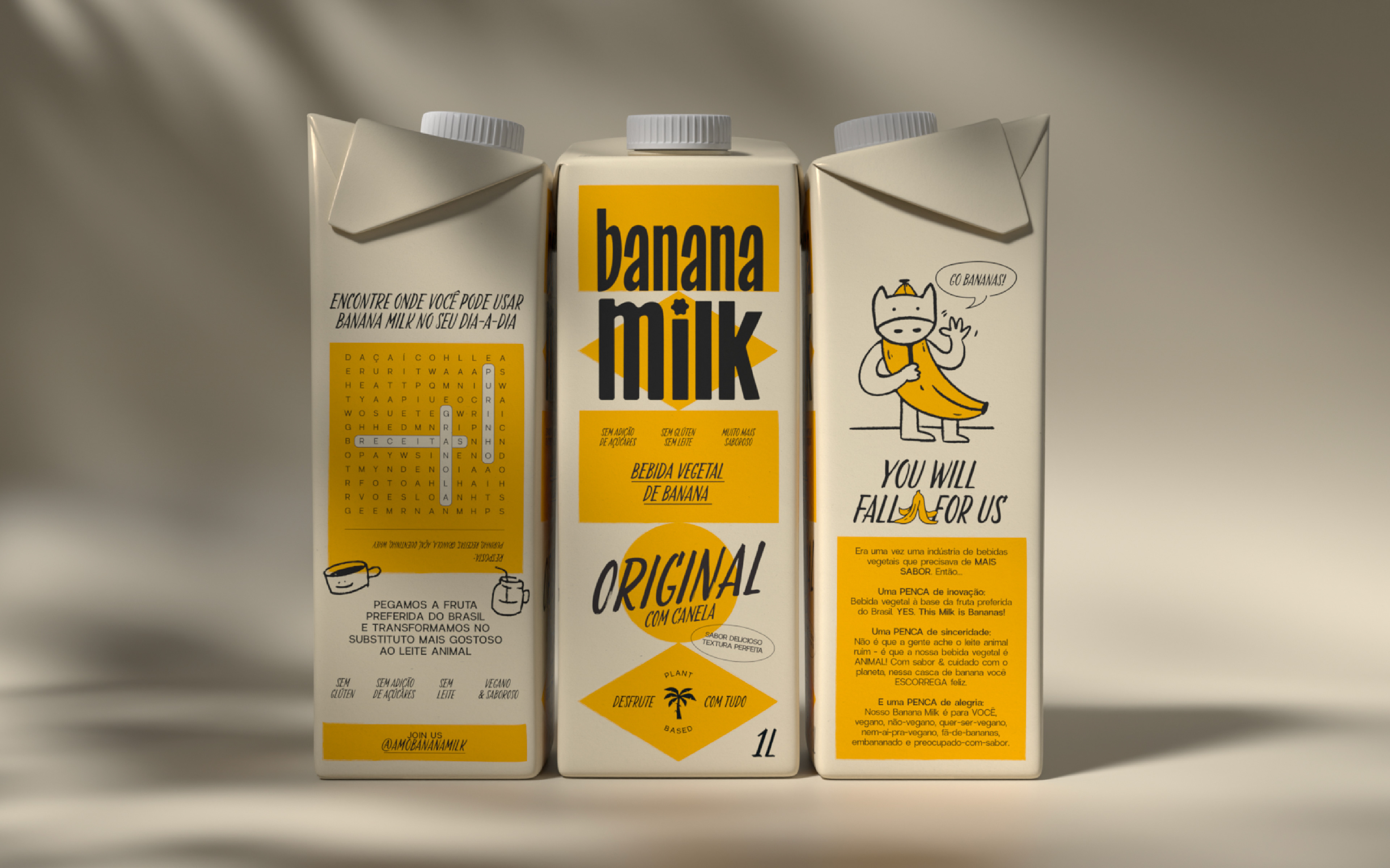
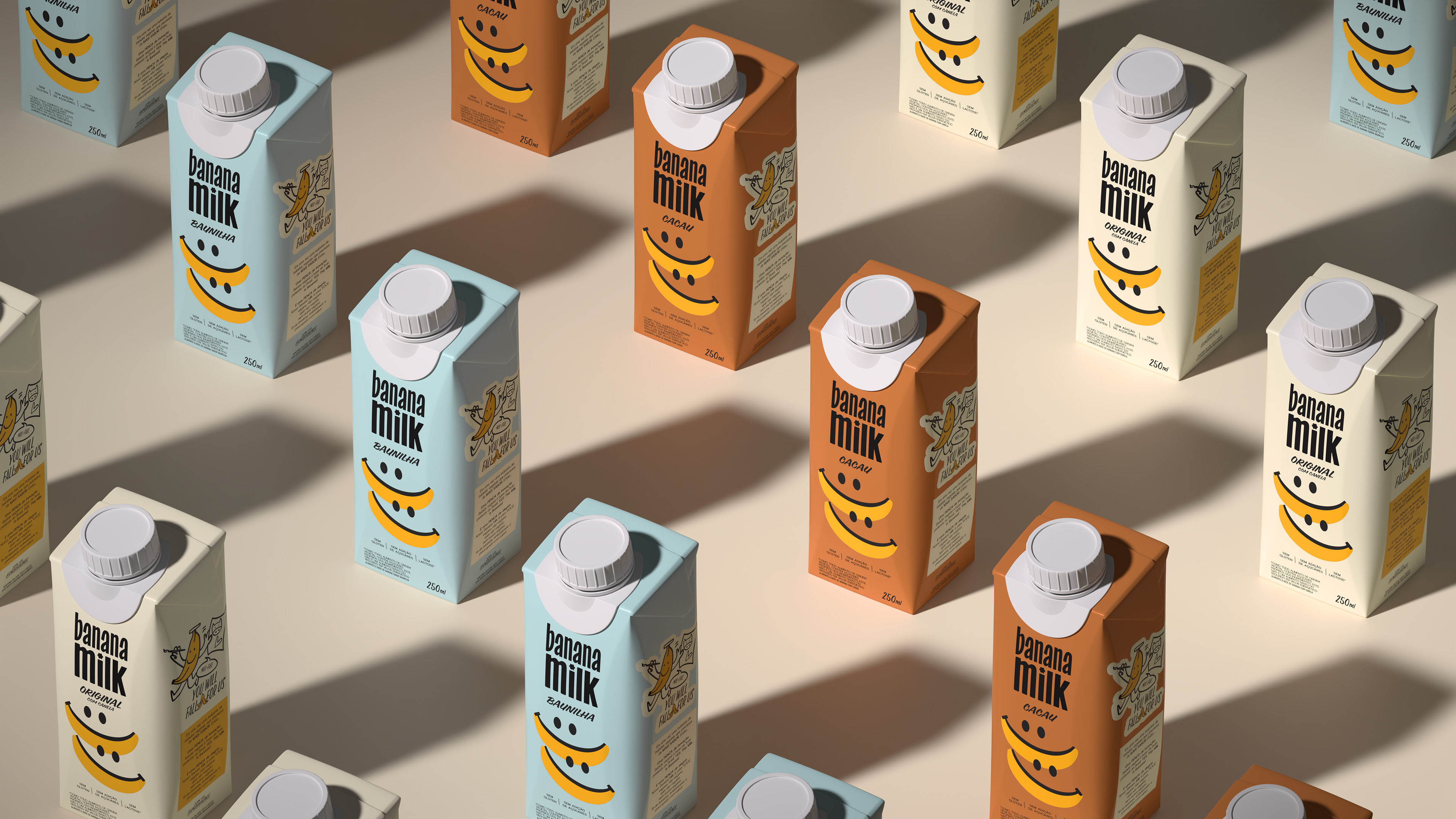
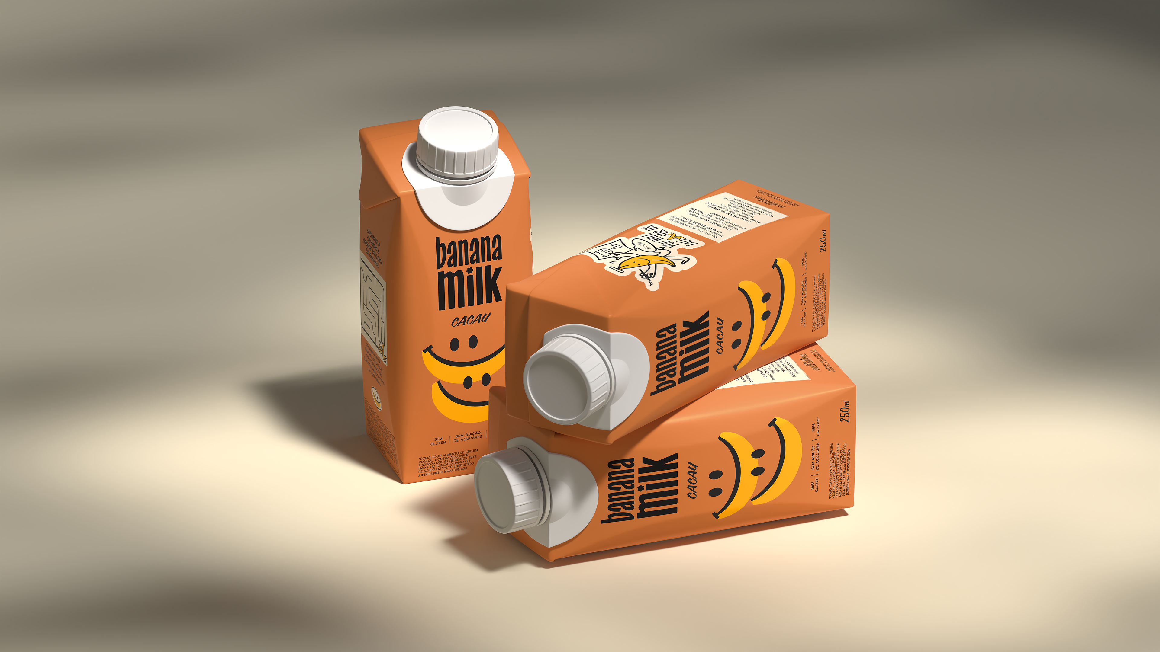
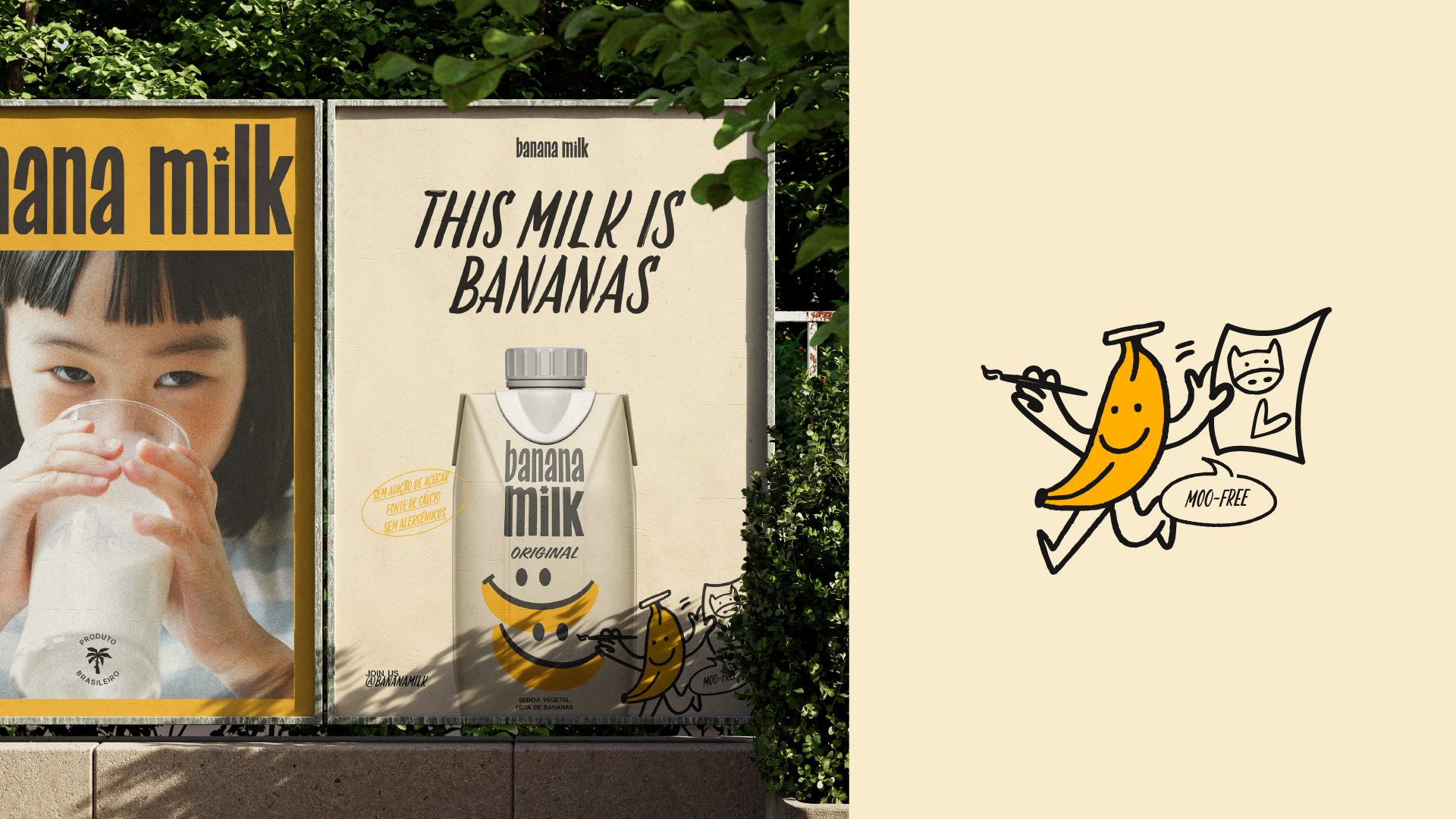
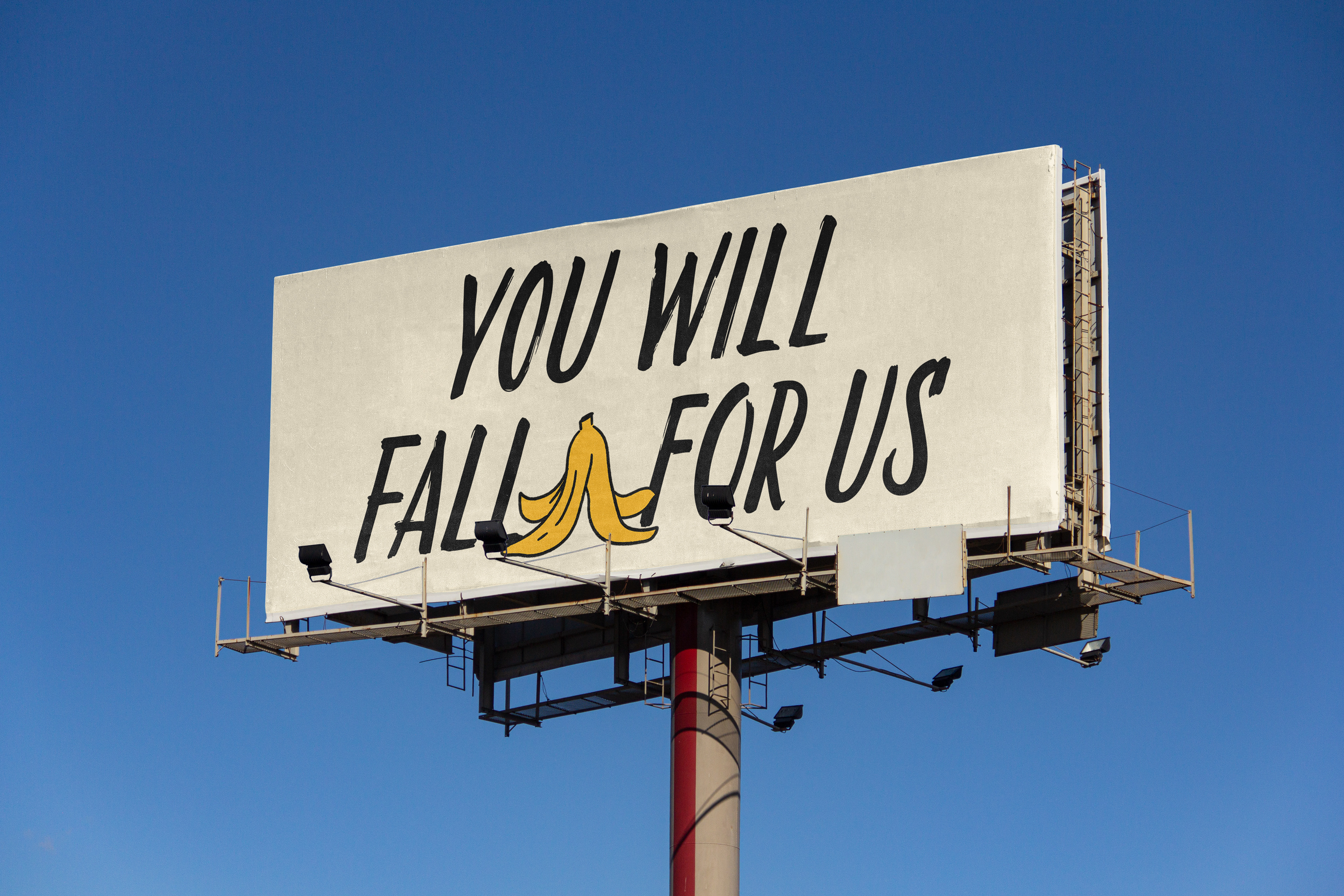
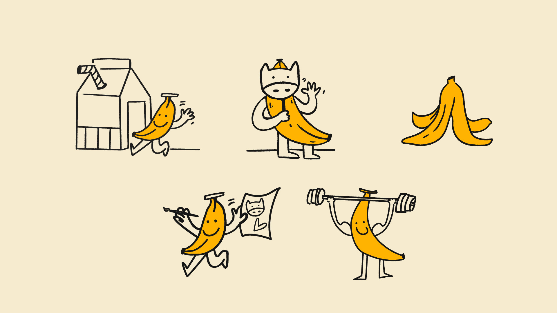
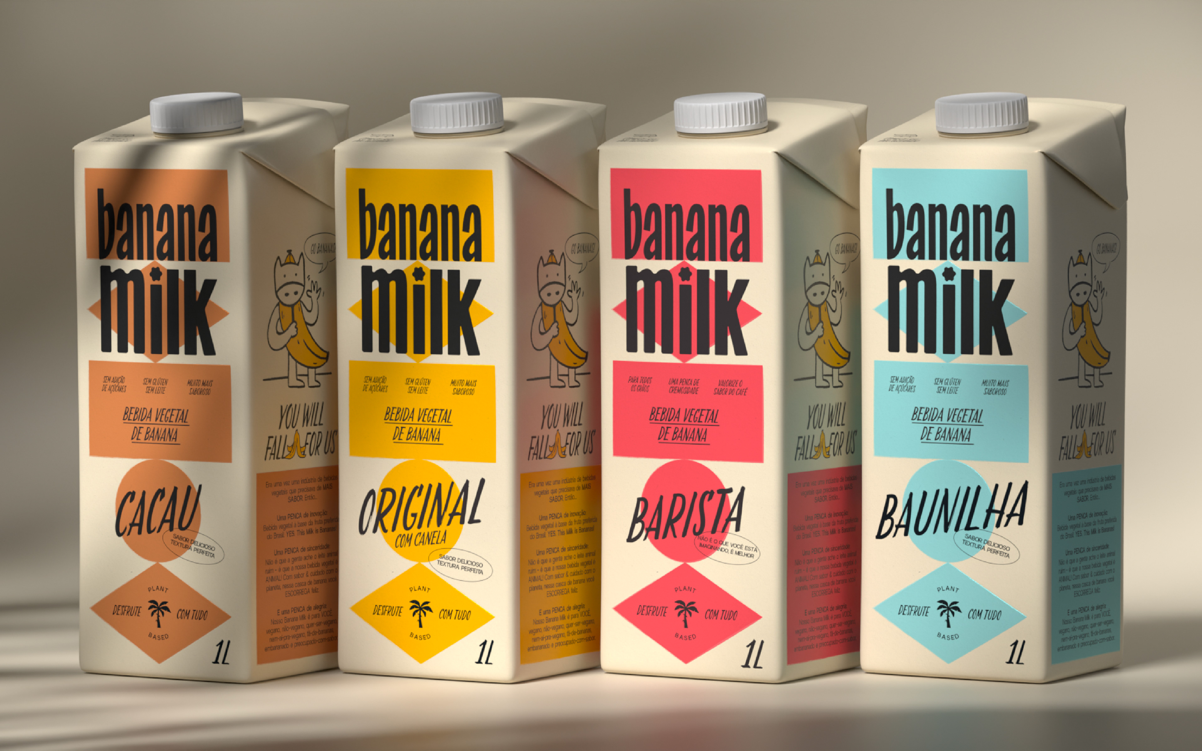
A key element of the identity is the banana character, which appears in various playful and unexpected representations. These illustrations help to define the brand’s universe, featuring imaginative depictions such as a banana dressed as a cow and a muscular banana. These visual elements contribute to the brand’s storytelling, making it engaging, humorous, and memorable.
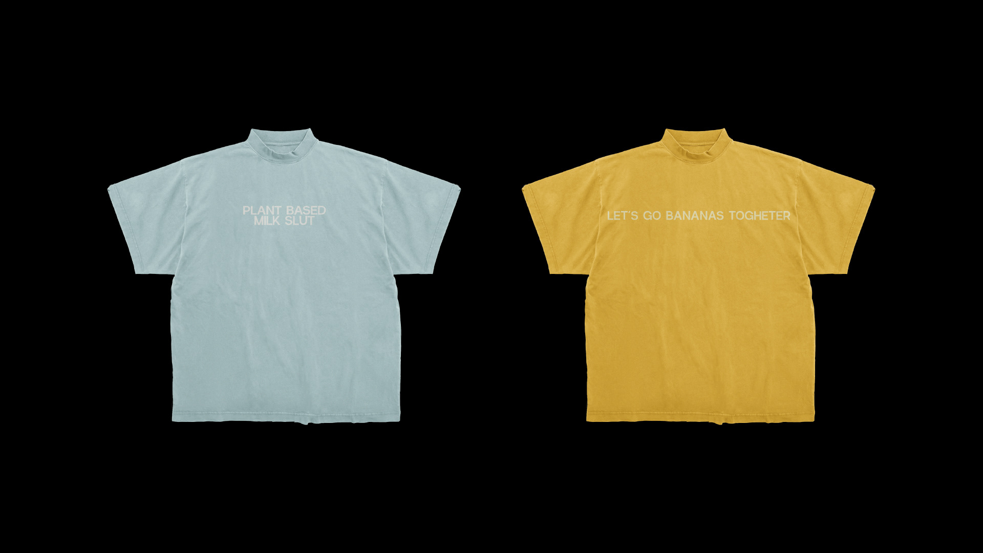
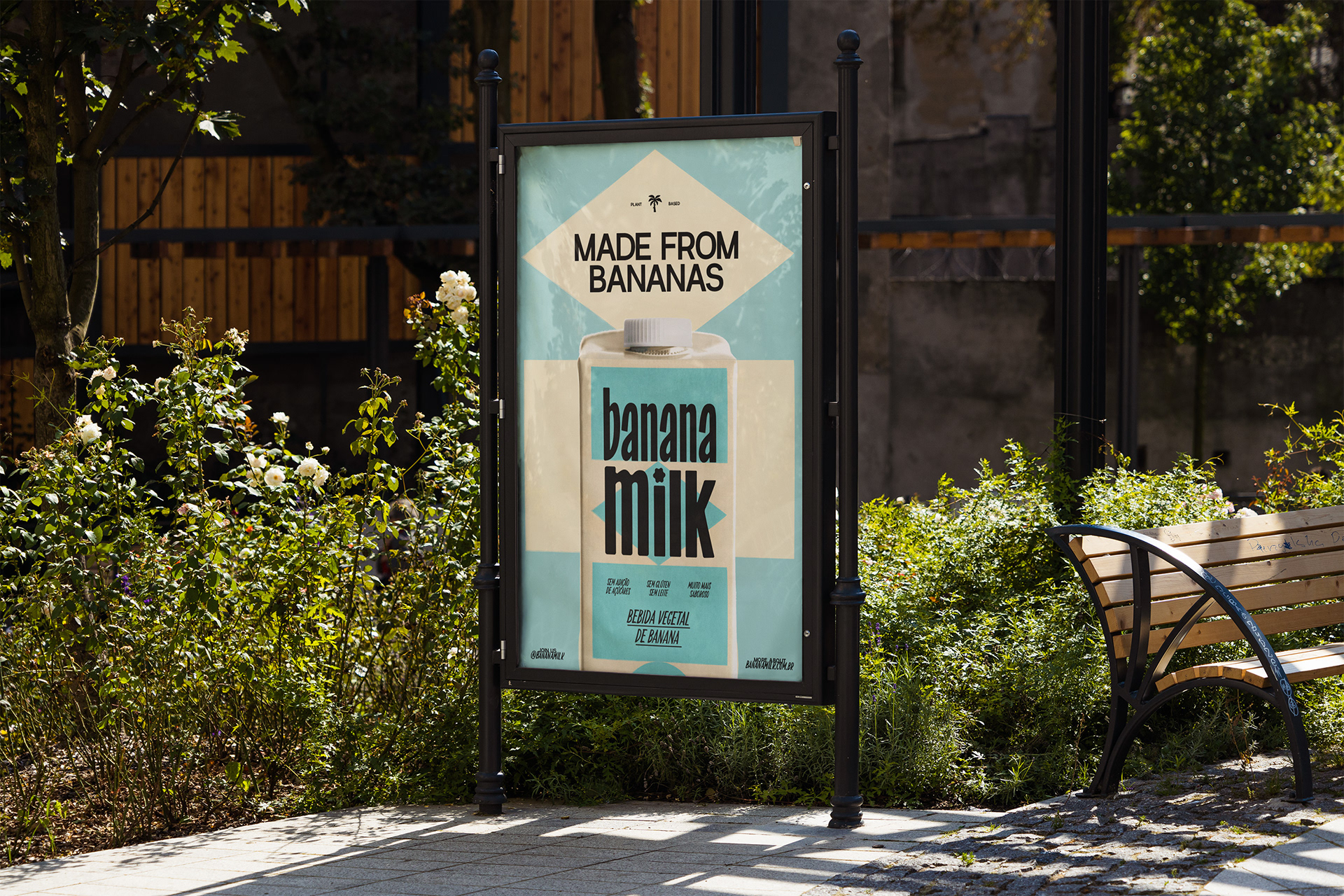
The packaging system structure takes inspiration from the geometric shapes found in the Brazilian flag. This foundation provides a cohesive yet dynamic framework, with chromatic variations assigned to each flavor, ensuring clear differentiation while maintaining a unified visual language. The institutional color palette consists of yellow, cream, and black—tones that convey warmth and represent the banana itself—while a secondary palette of six colors, derived from the product’s different flavors, complement the brand’s visual identity
Creative Direction: Luiz Pegoraro
Graphic Design: Luiz Pegoraro, Fabian Shinzato, Victória Pretto, Beatriz Bastos
Brand Strategy: Luiz Pegoraro, Fabian Shinzato, Victória Pretto
3D and motion: Clint Studio
Illustrations: Bea Bastos