Design principles:
Loud – a mixture of all-caps, vernacular sans-serif typefaces all around
Simple, but with personal – no shiny graphics, but show some character here and there
Tradition – there's a strong respect for traditions
Made by hand with love – it's a labour of love, it's a family business and pizza is a national symbol.
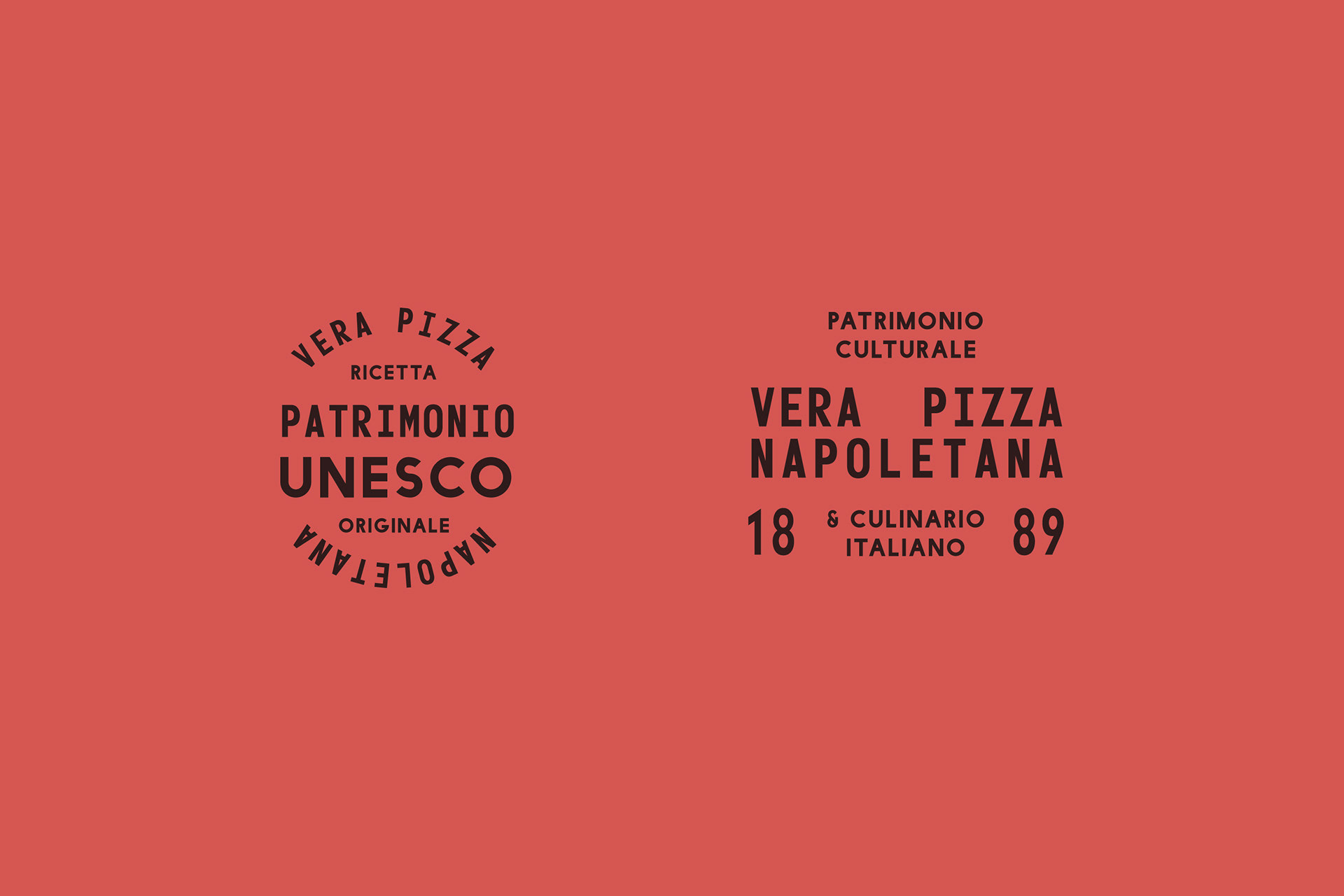
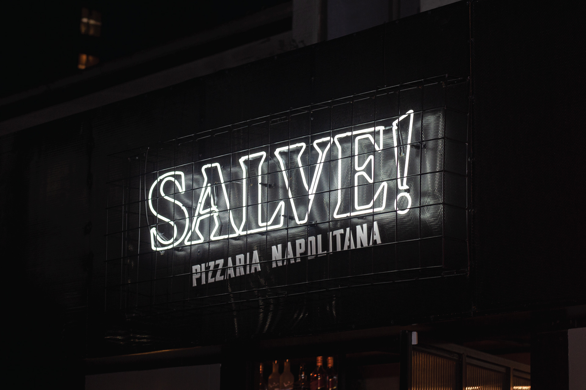
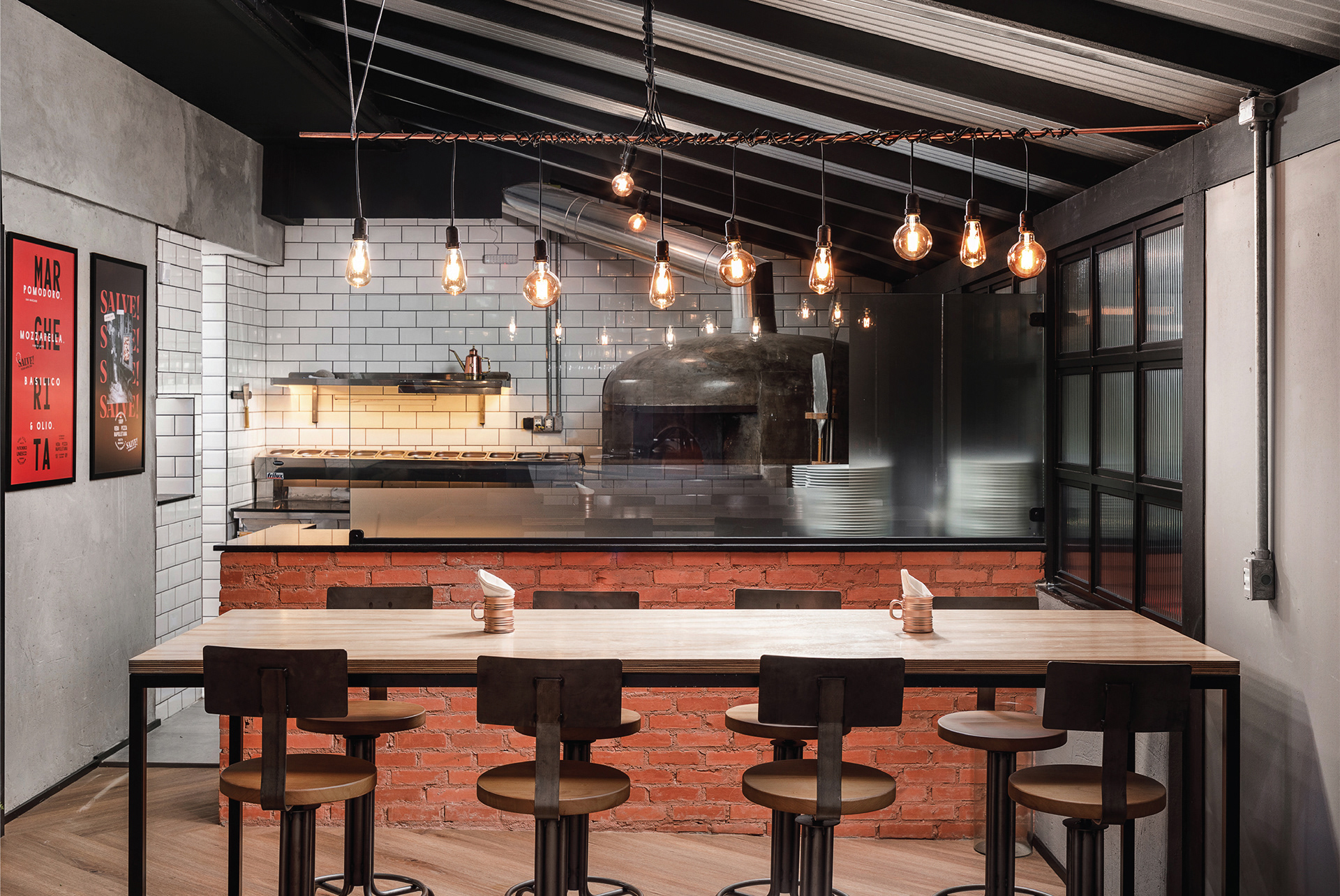
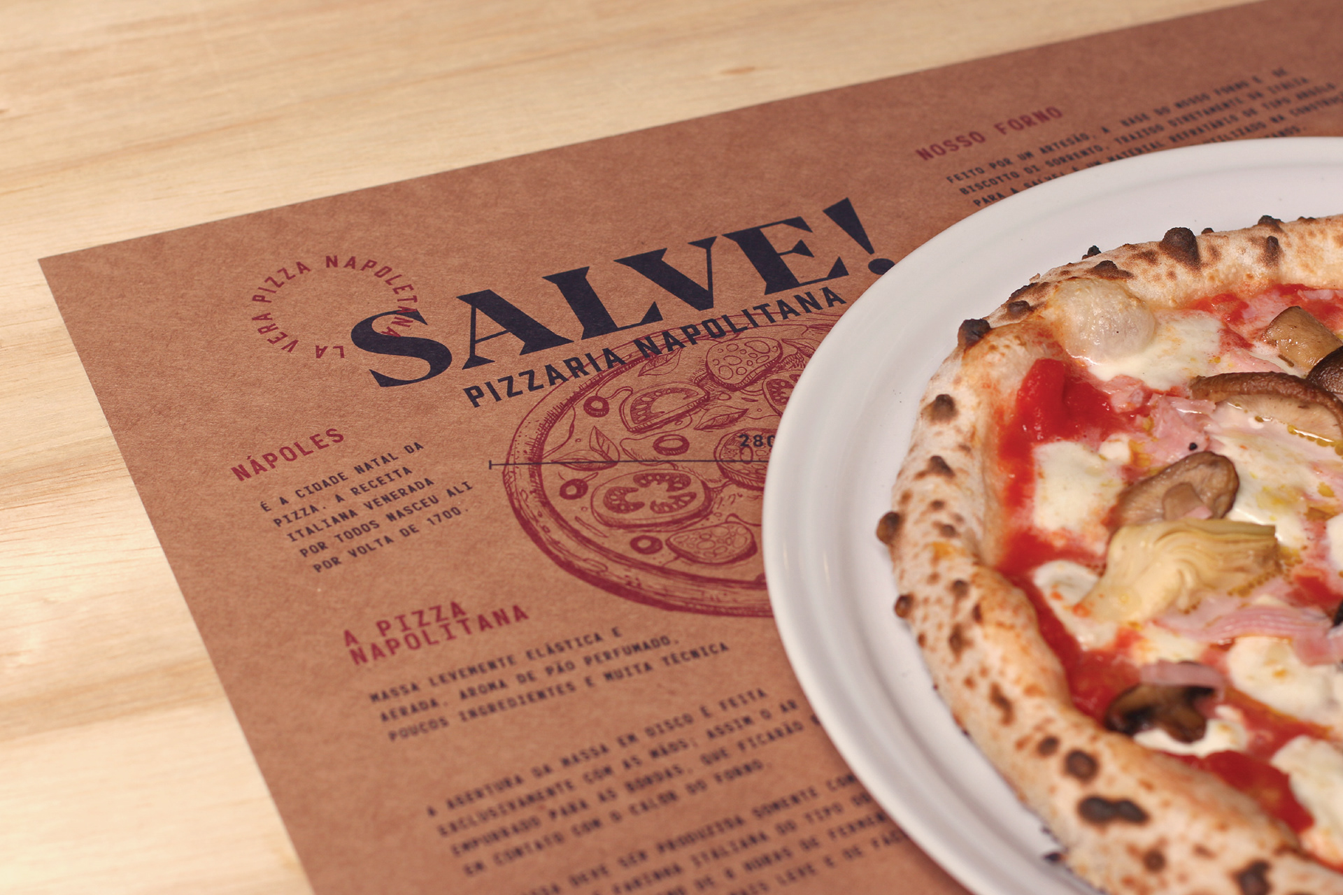
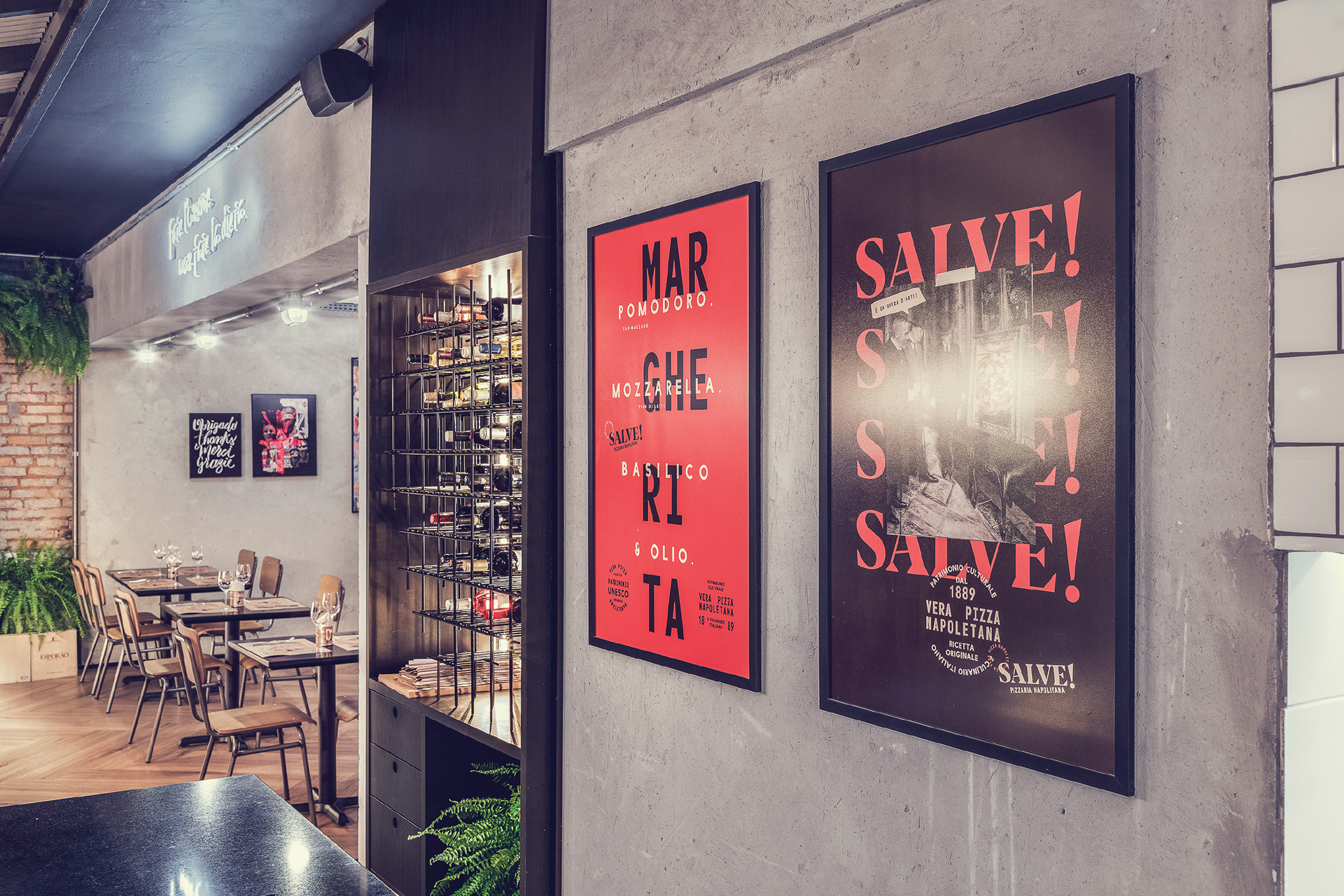
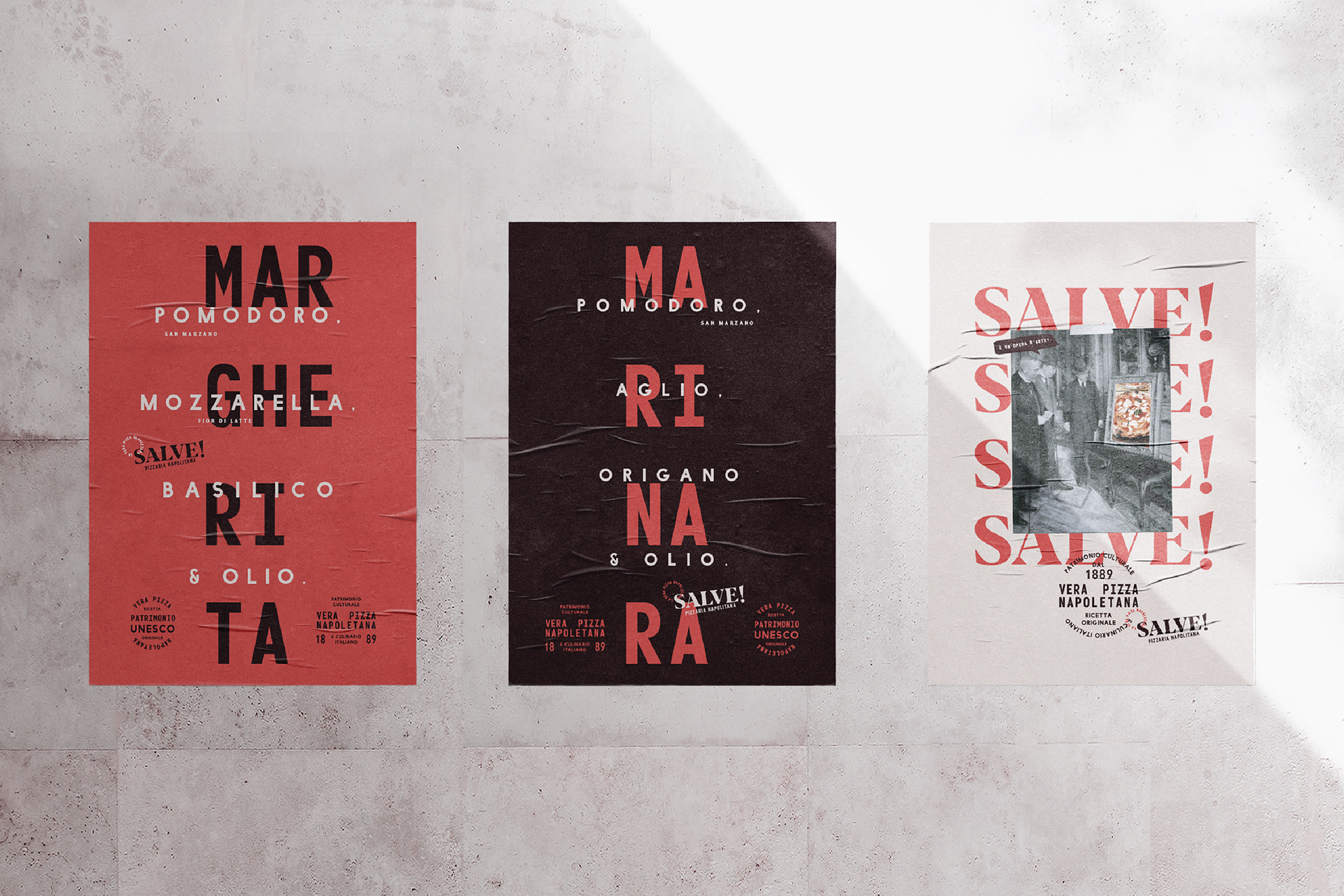
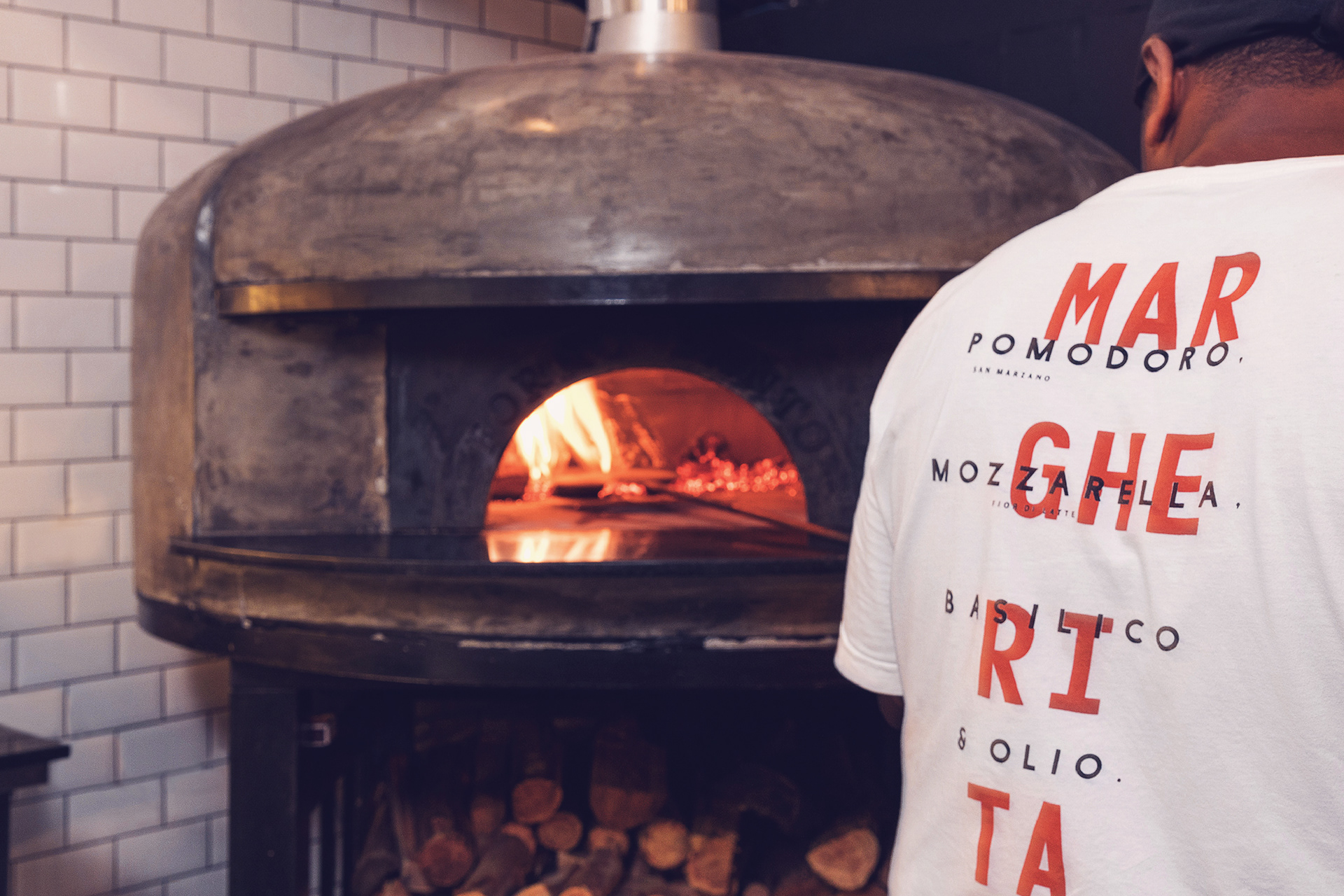
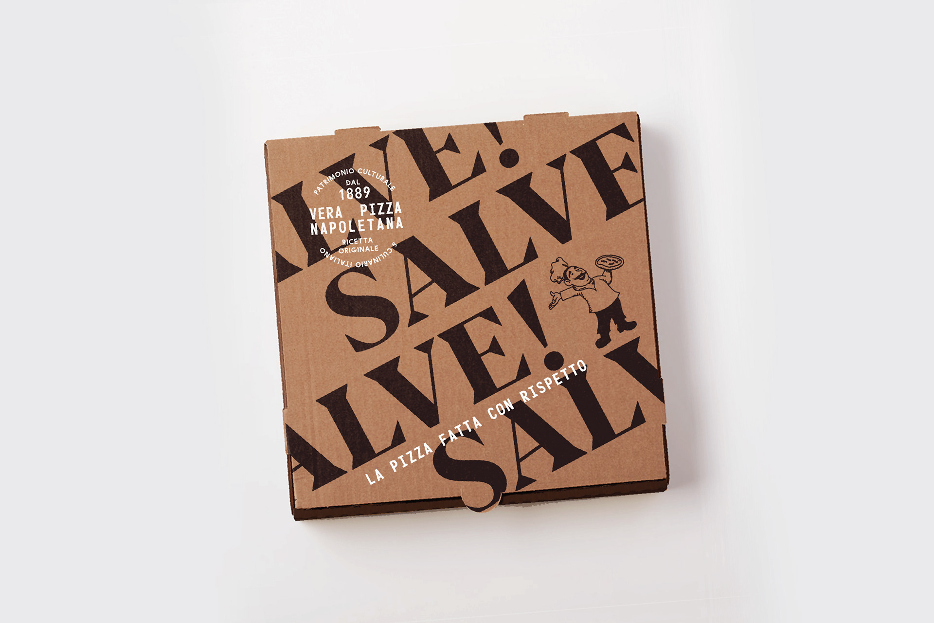
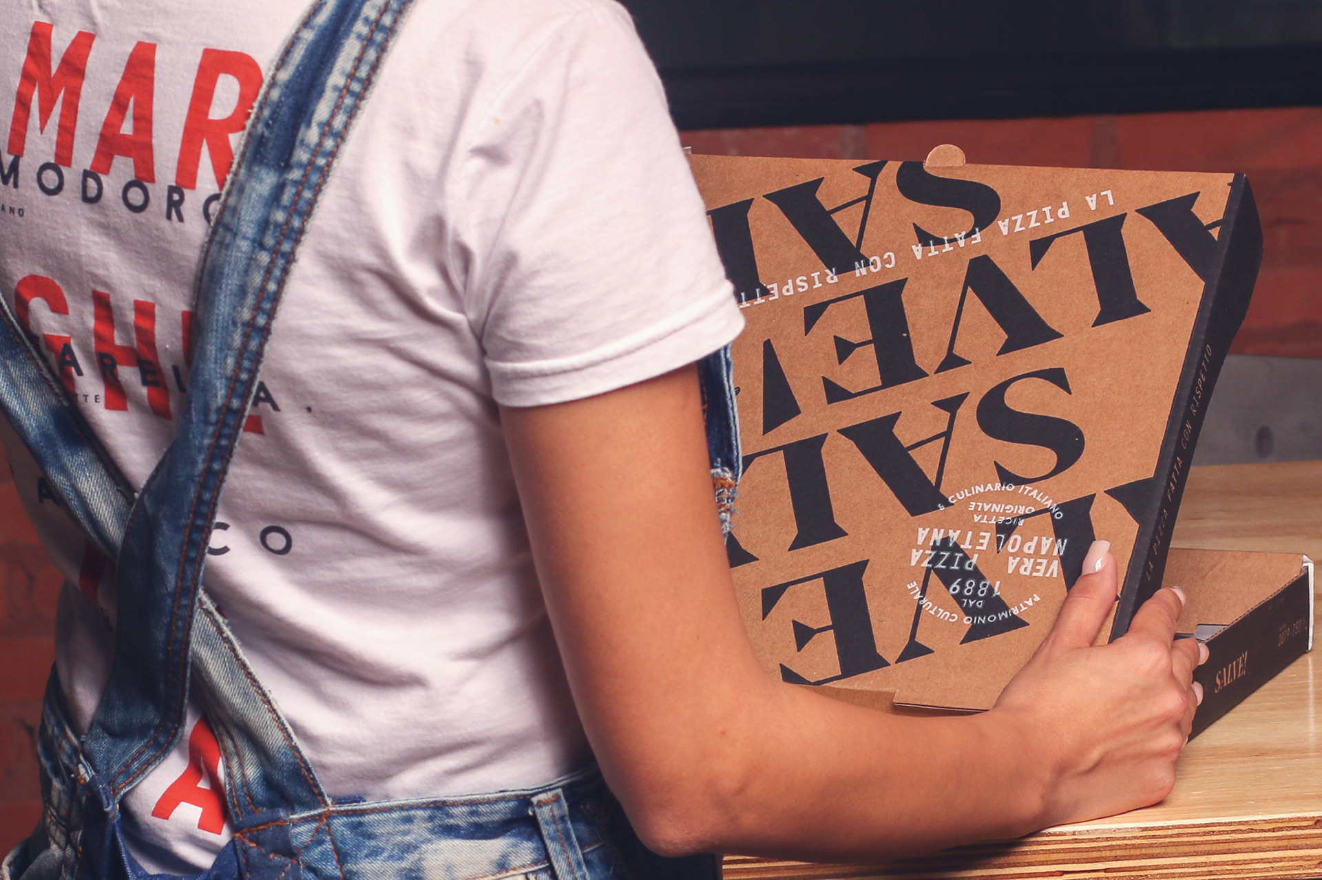
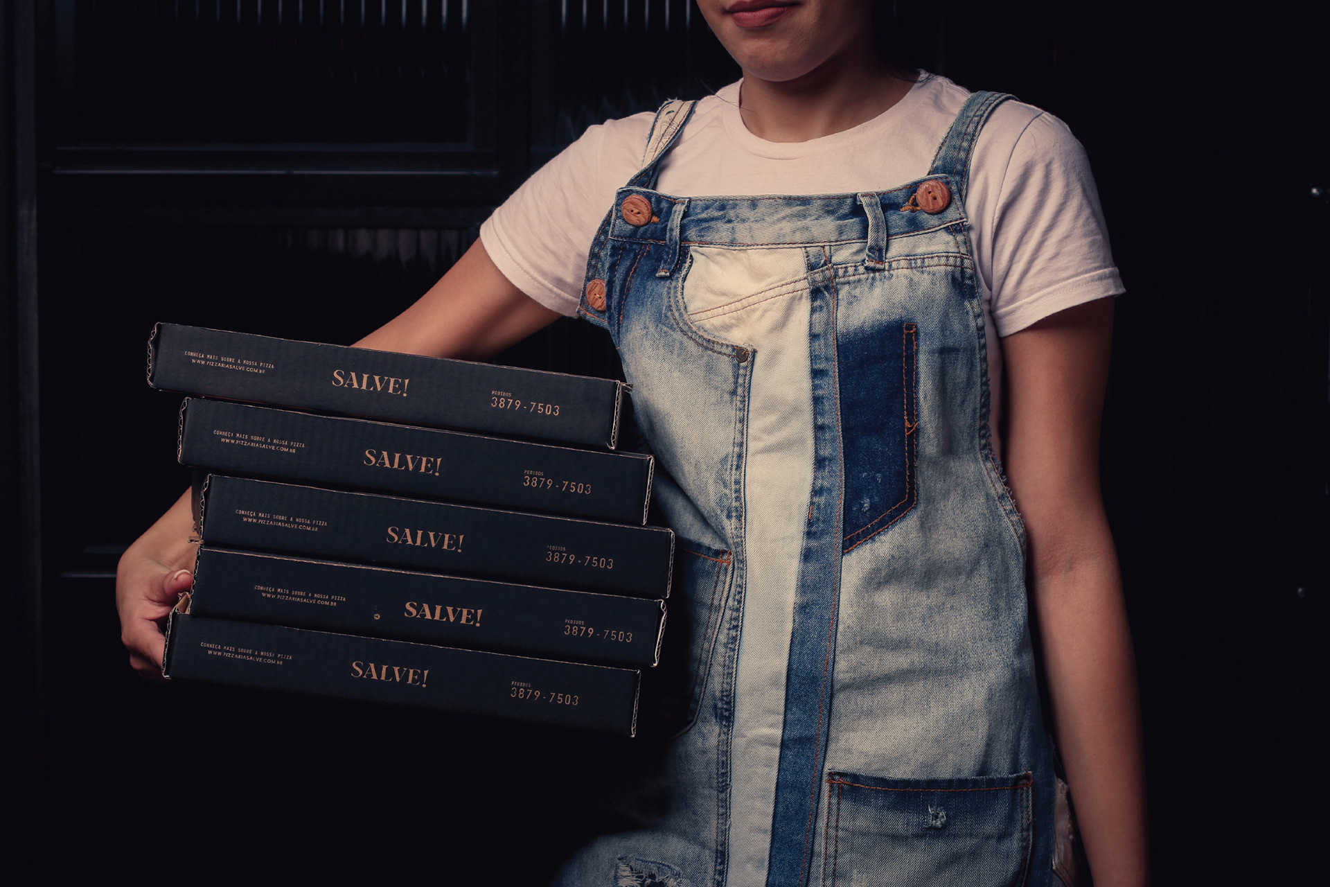
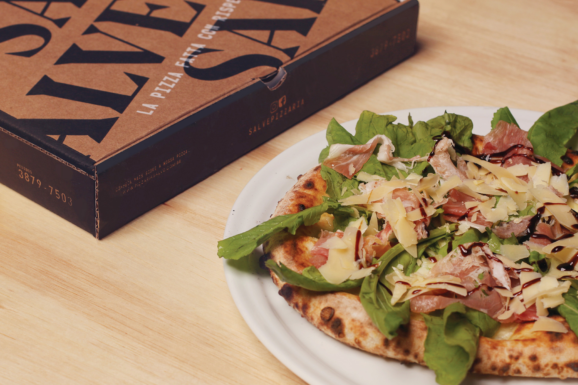
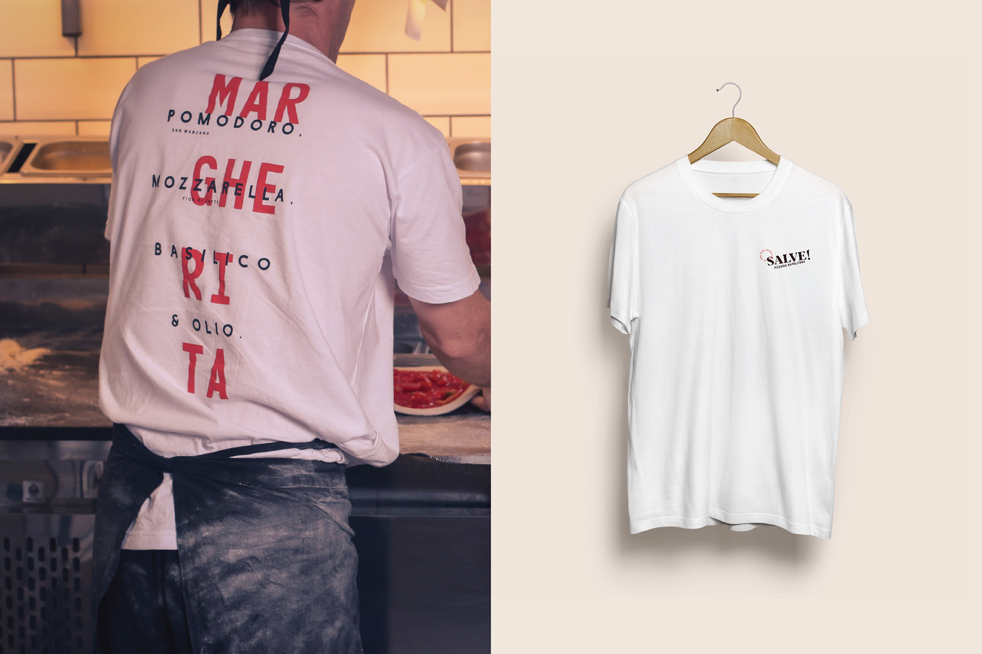
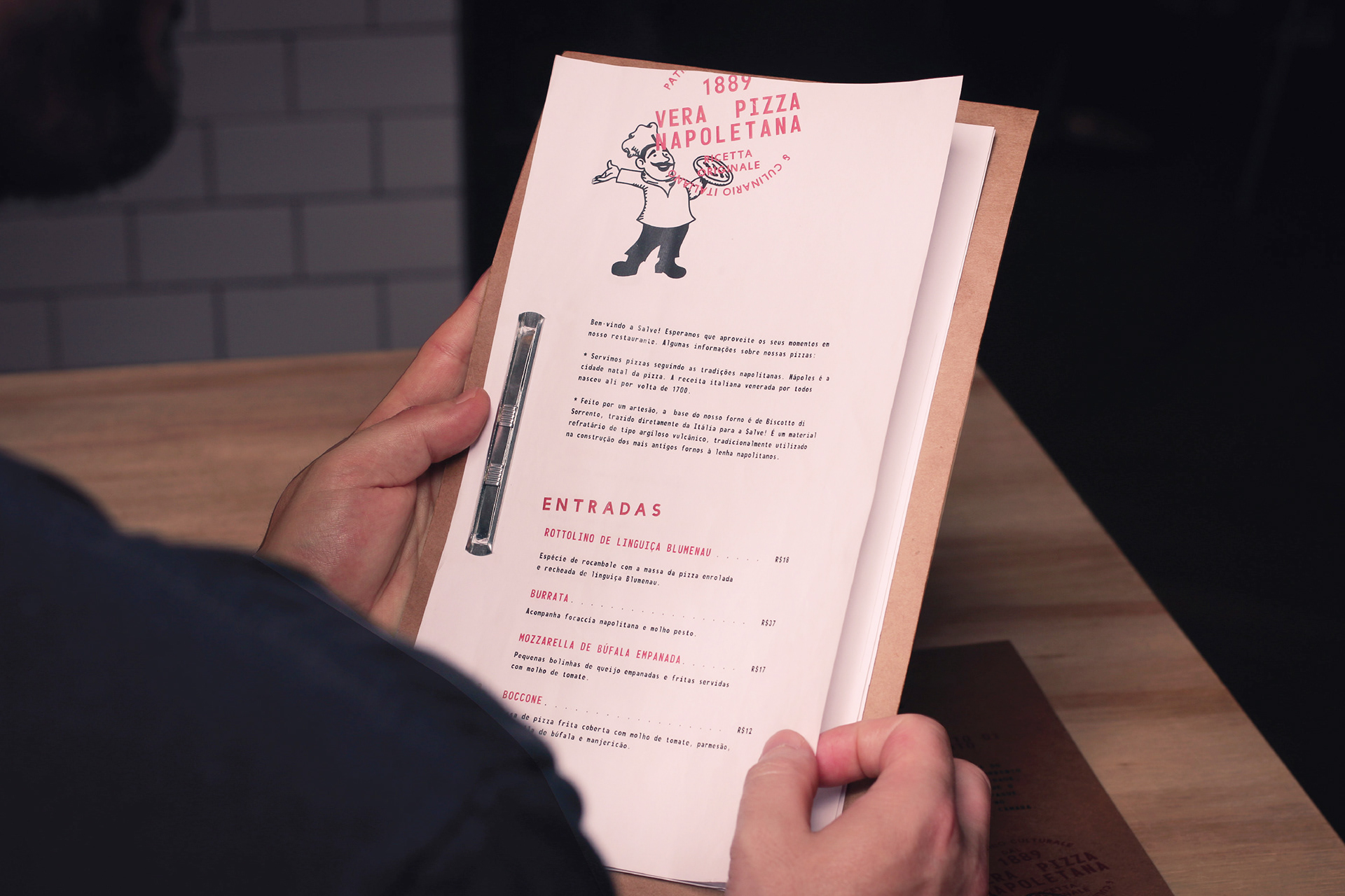
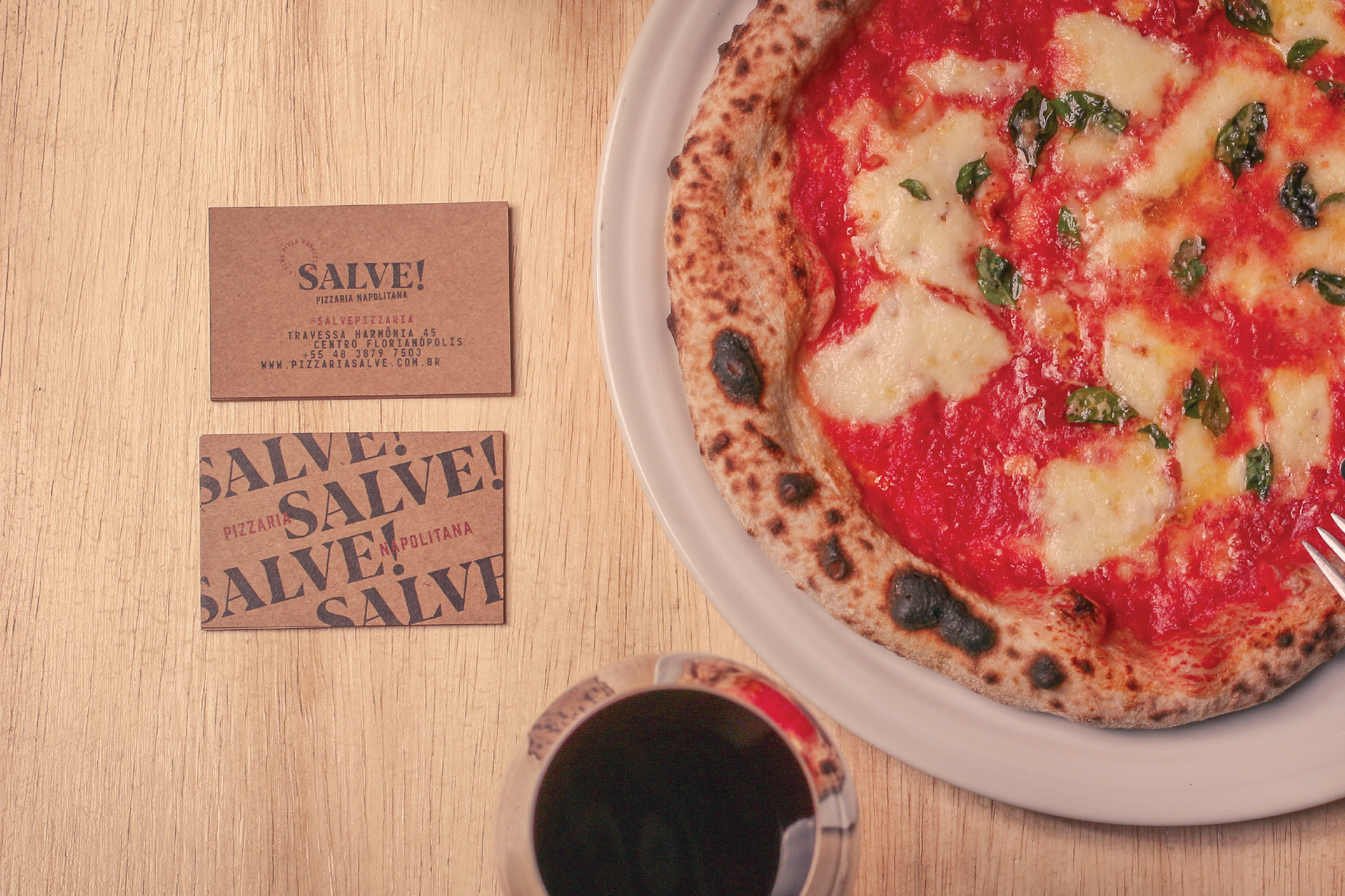
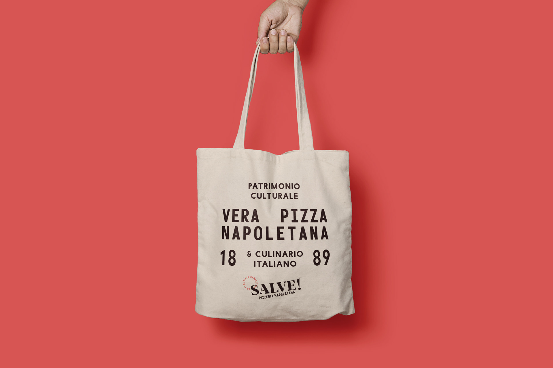
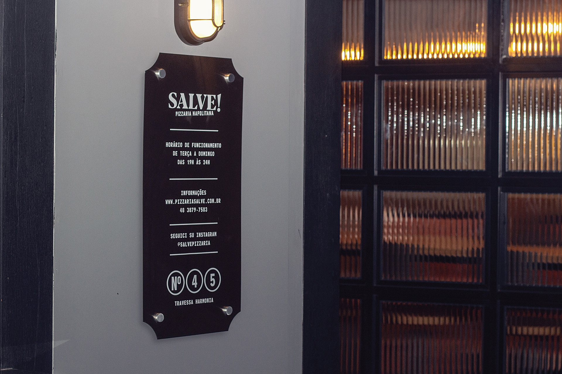
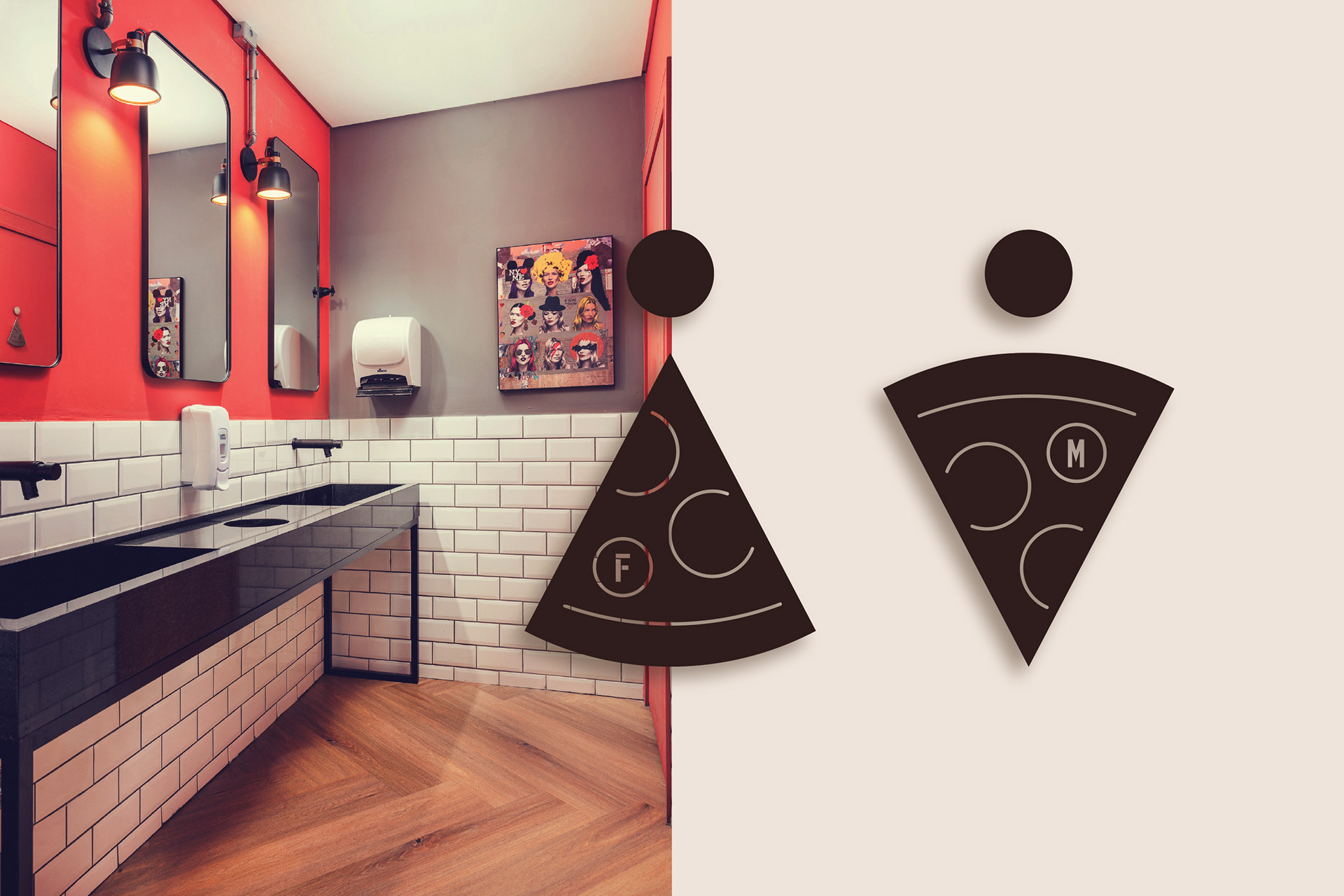
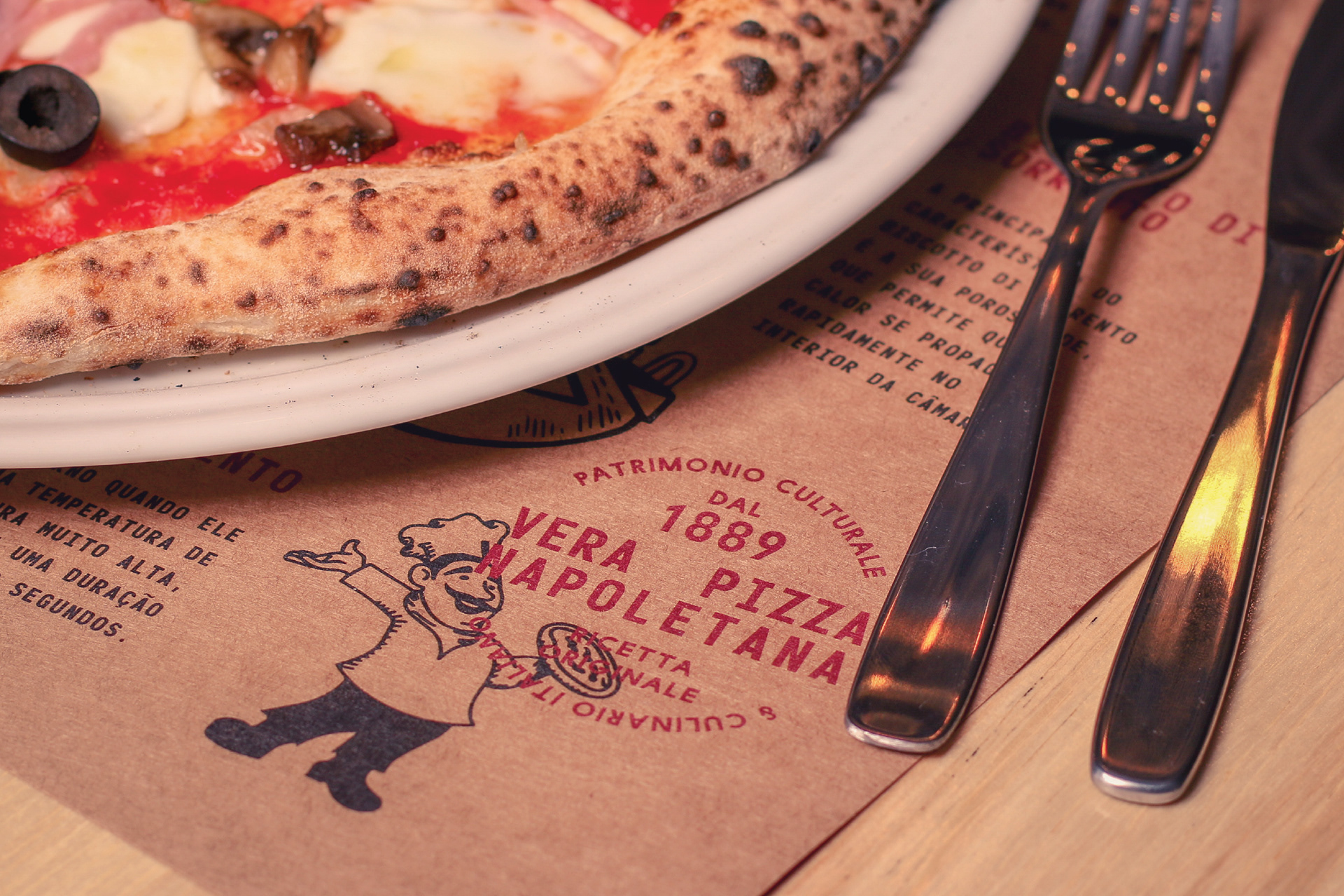
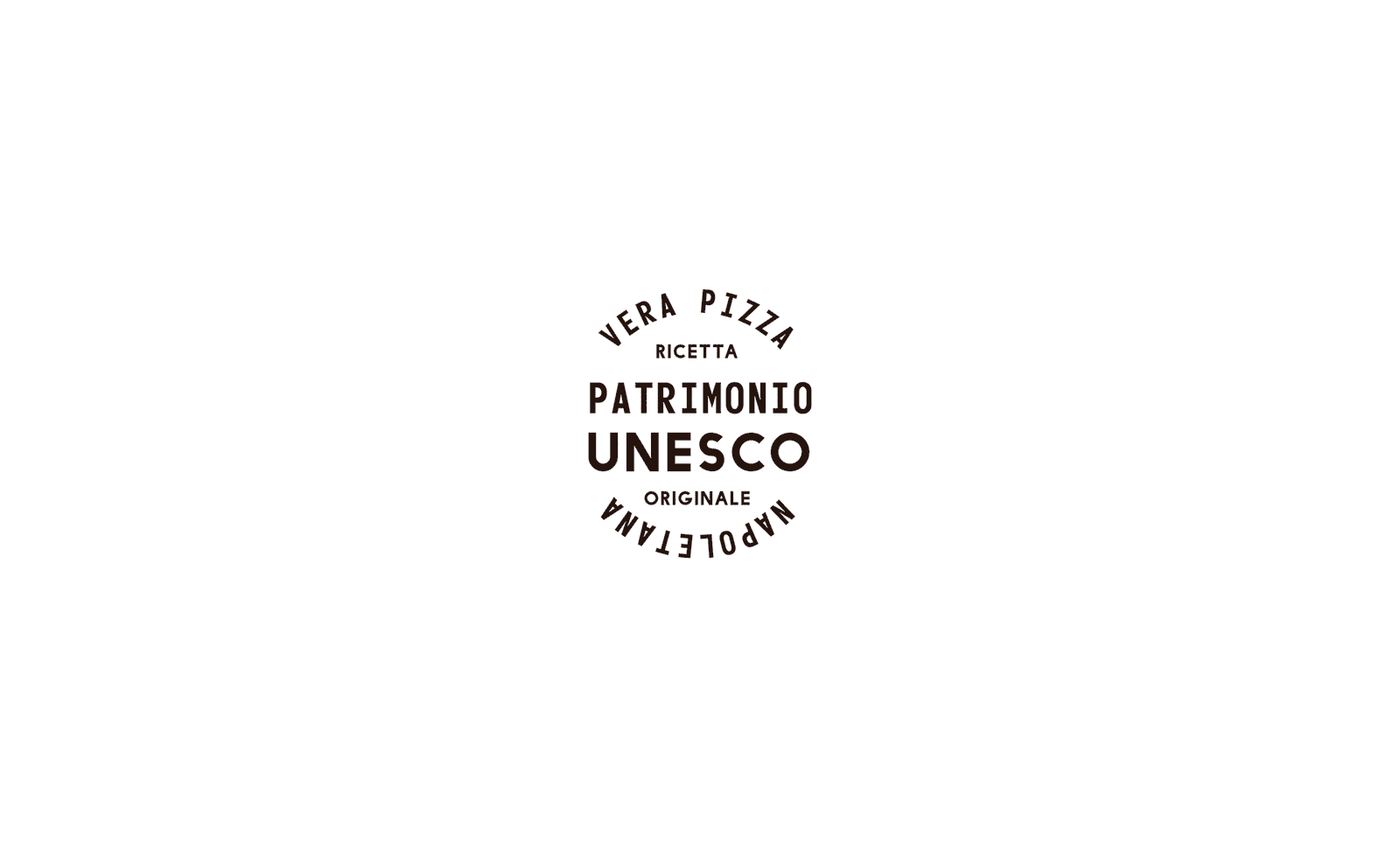
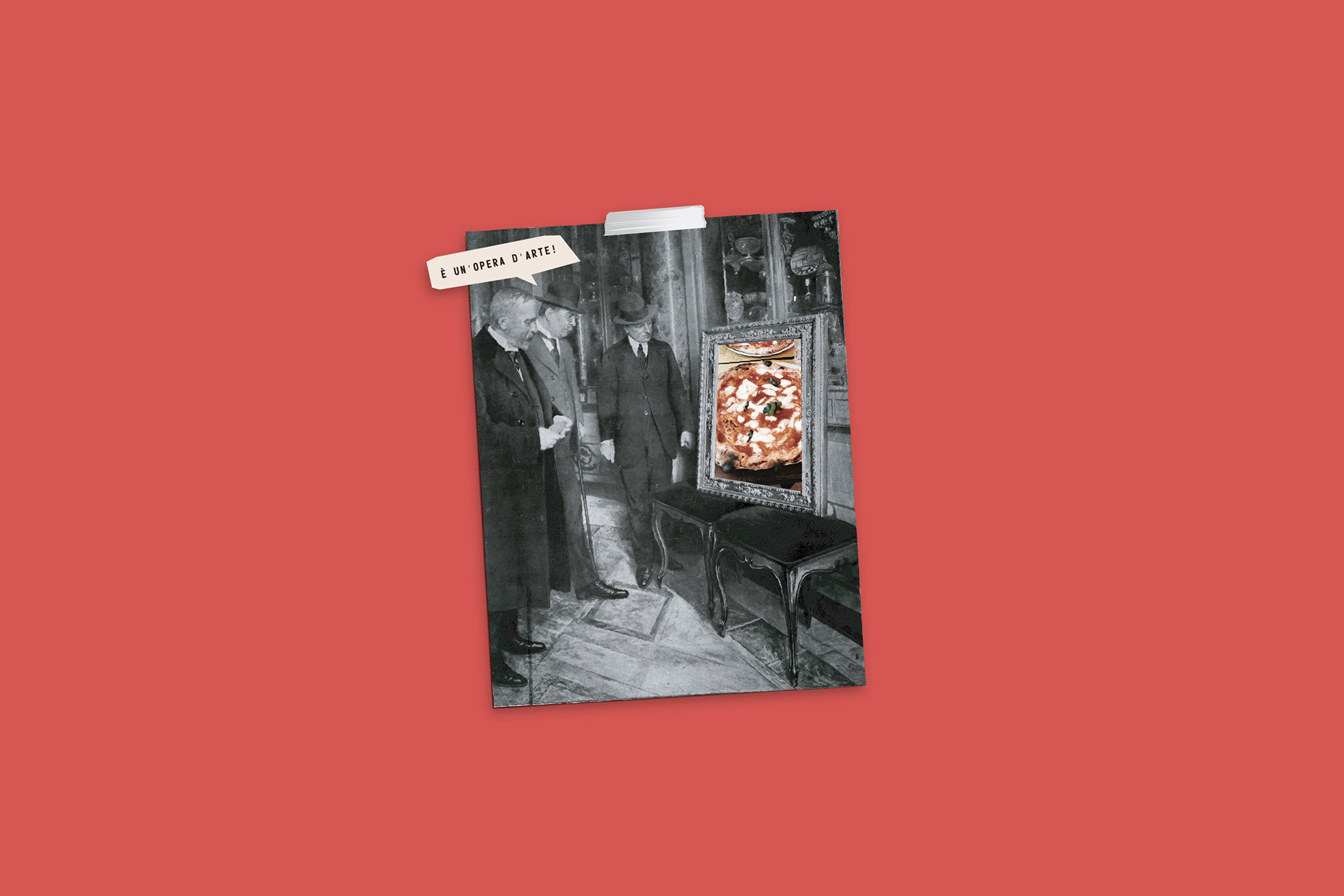
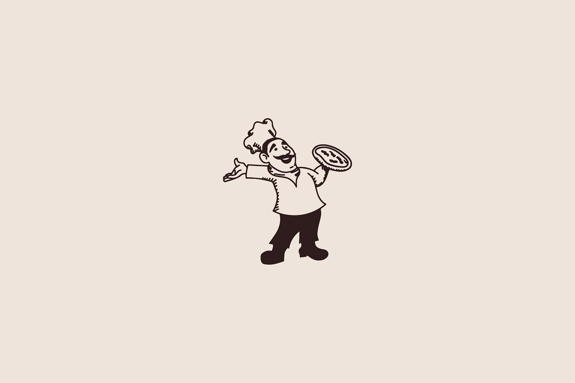
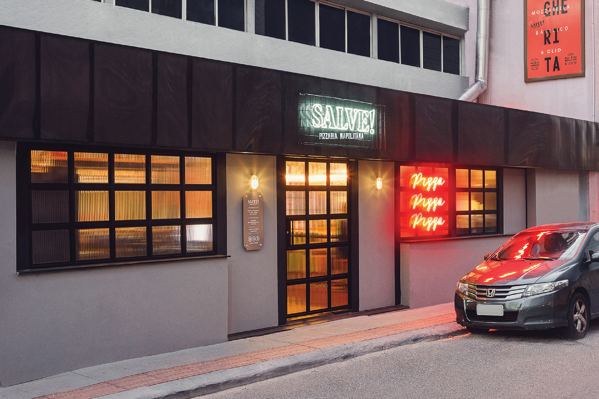
So there's a lot of love involved Salve! is a friendly way of saying hi. It represents the passion and friendliness of Neapolitan people. It is also a simple, short name that fits well to a hip new restaurant. The typography is a mixture of similar sans-serif typefaces, in all-caps, with irregular spacings to mimic the typography we saw in Napoli. We also decided to pay a homage to the traditional Italian restaurant graphics by including an illustration of a pizzaiolo. If you look around, many Italian restaurants use the figure of a chef in their pizza boxes and menus. So we illustrated a very friendly pizzaiolo using the same style of illustration we found in our research. But most of all we found that Neapolitan pizza is beautiful. To convey the purity of the Italian pizza, we created posters containing their simple recipes.
Loud – a mixture of all-caps, vernacular sans-serif typefaces all around
Simple, but with personal – no shiny graphics, but show some character here and there
Tradition – there's a strong respect for traditions
Made by hand with love – it's a labour of love, it's a family business and pizza is a national symbol.
So there's a lot of love involved Salve! is a friendly way of saying hi. It represents the passion and friendliness of Neapolitan people. It is also a simple, short name that fits well to a hip new restaurant. The typography is a mixture of similar sans-serif typefaces, in all-caps, with irregular spacings to mimic the typography we saw in Napoli. We also decided to pay a homage to the traditional Italian restaurant graphics by including an illustration of a pizzaiolo. If you look around, many Italian restaurants use the figure of a chef in their pizza boxes and menus. So we illustrated a very friendly pizzaiolo using the same style of illustration we found in our research. But most of all we found that Neapolitan pizza is beautiful. To convey the purity of the Italian pizza, we created posters containing their simple recipes.